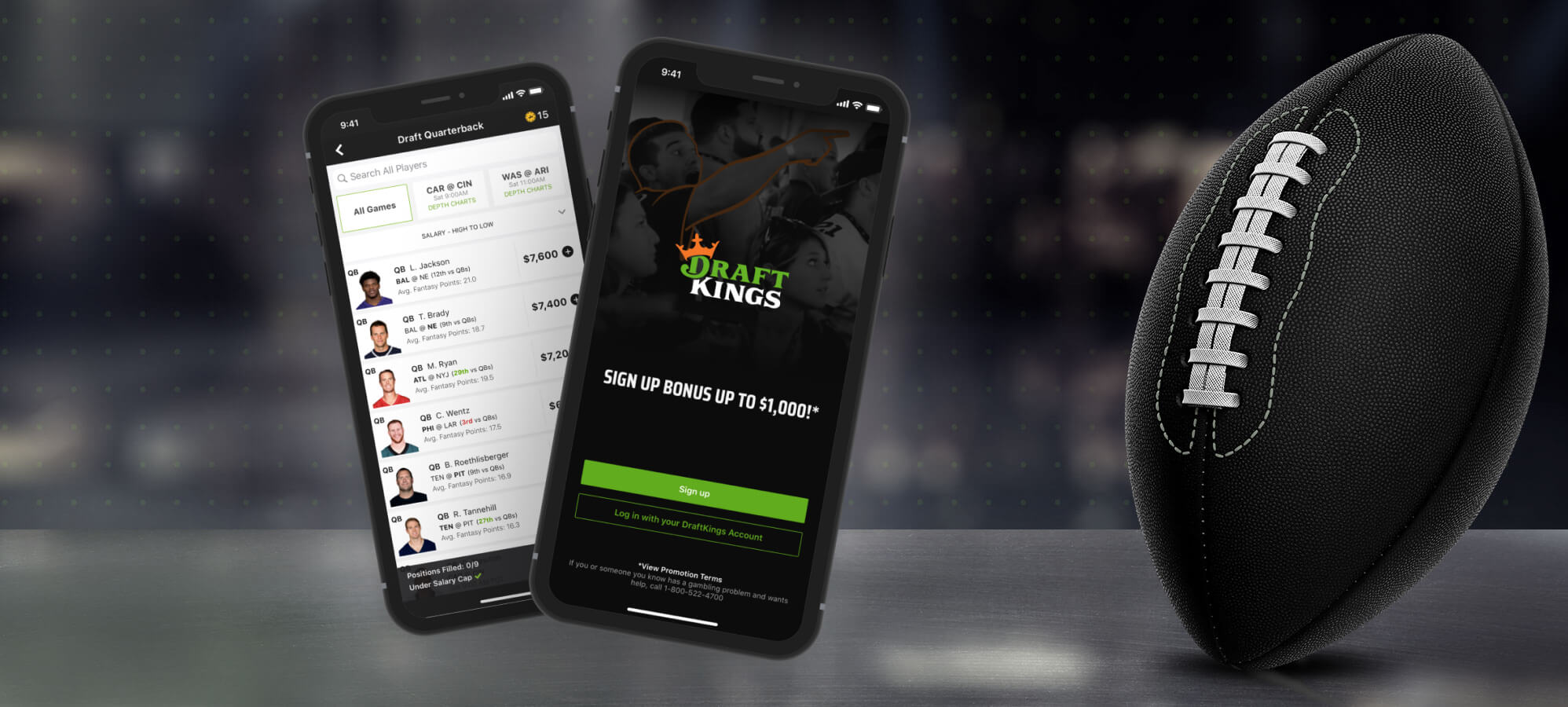
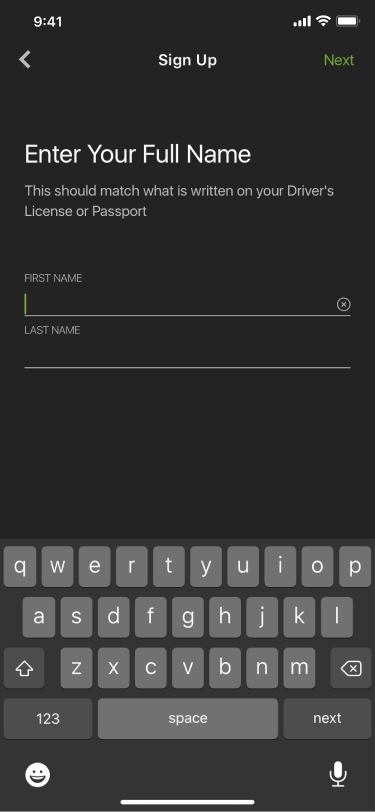
DraftKings First Time UX
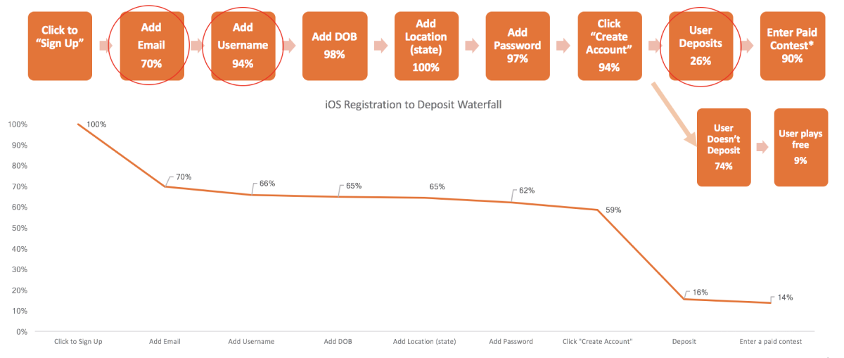
I was presented with data (the graph below) that showed 86% of DraftKings users never entered a paid contest the first time they used the app. We wanted to redesign the first time user experience (FTUX) to increase that number by 25%. I user tested the current flow, identified the pain points, then redesign the flow to fix those issues, did another round of user research to determine if users entering paid contests increased.
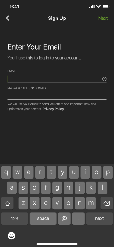
Below is a walkthrough of the previous flow with some insights from the user research.
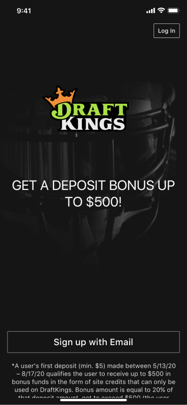
Old design. Not appealing based on user testing. Doesn’t seem legitimate.

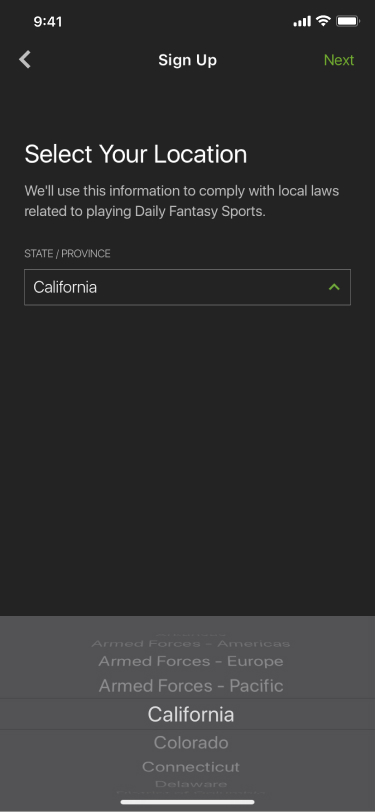
Not clear. You need to pick the state you live in, and not your current geolocation.

User quote: “You just asked me for that.” Not clear difference between register state screen.
User quote: “Where is this money going? What do I get with it?” Not educated enough on product yet. Losing 43% of users.
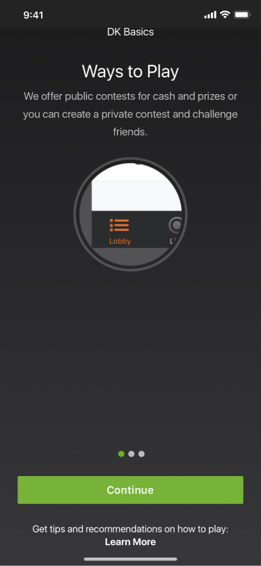
Image has no context. Only 18% of users scrolled to the next 2 slides. Supposed to educate users on the product.

User quote: “I came here to play football, not golf.” No idea what sports user likes. Should give options.

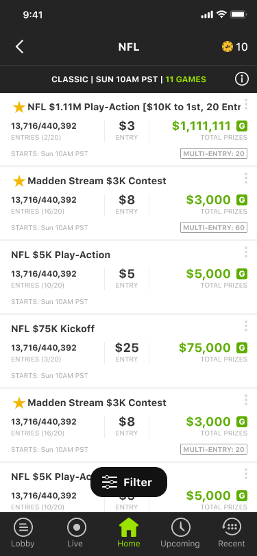
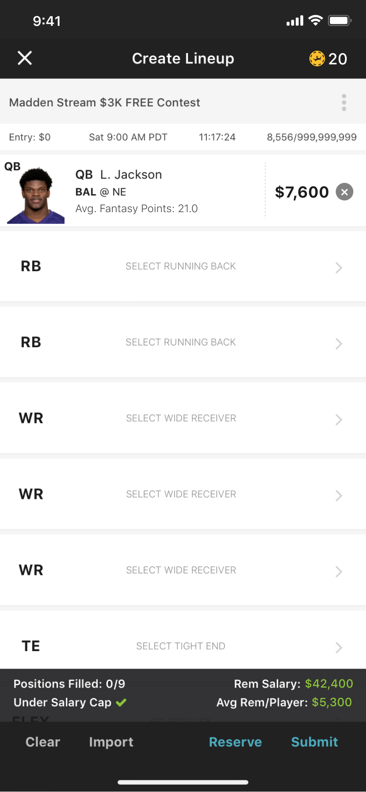
Not clear. 0% of users knew what “M20” or “SUNDAY” boxes meant.
Not Clear. 0% of users knew what “FPPG”, “OPRK” or Salary meant. Not enough explanations.
After doing some user research (done by me and our lead researcher Annie Corbett). We found that there were some pretty major issues with the previous flow that we had to address.
- Users said more overall guidance would have made their experience better.
- Users need to know how to draft a line up (staying under salary cap, understanding the rules and scoring, all of the terminology and less acronyms).
- Asking for user location multiple times made the app lose some credibility.
- Navigating from registration to your first contest was confusing.
- User quote: “I didn’t know how to set a team or if I was going against anyone. It was all just very confusing.”
- User quote: “I didn’t quite understand how to choose the right players while considering salary.”
After going over all the feedback from user research I made design updates and changed the order of some of the screens to see if those would get better results.
Original Design
Redesign
More modern look. Updated fonts, imagery and buttons. Comes off as more legitimate than the previous design.
Original Design
Redesign
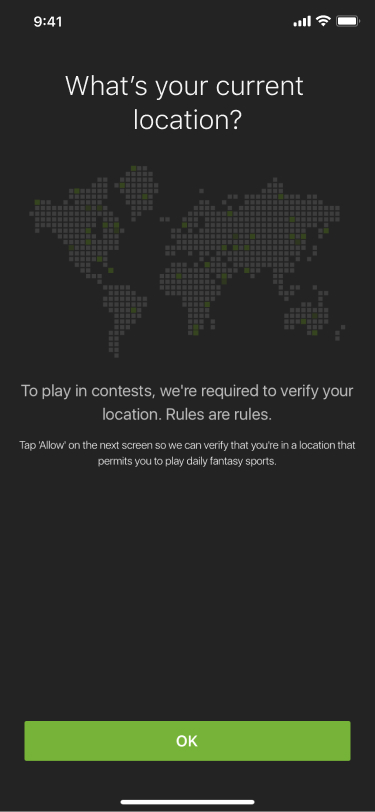
Changed headline from, “What’s Your Location?” to, “What’s Your Current Location?” This got rid of the confusion the users had with the next screen.
Original Design
Redesign
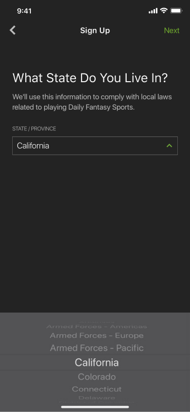
Changed headline from, “Select Your Location” to, “What State Do You Live In?” so it would be clearer to users what info they were being asked for.
Original Design
Redesign
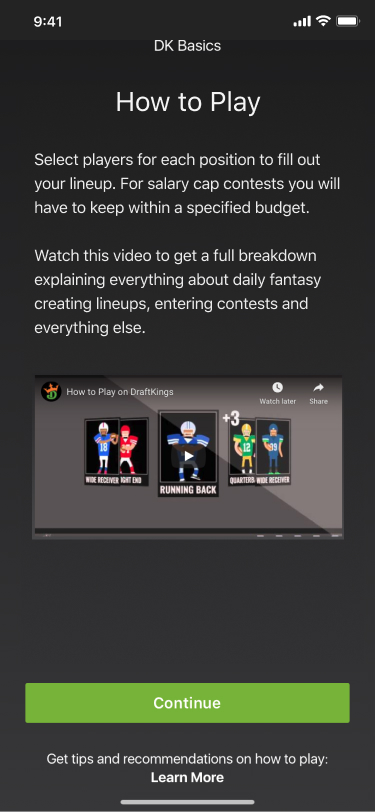
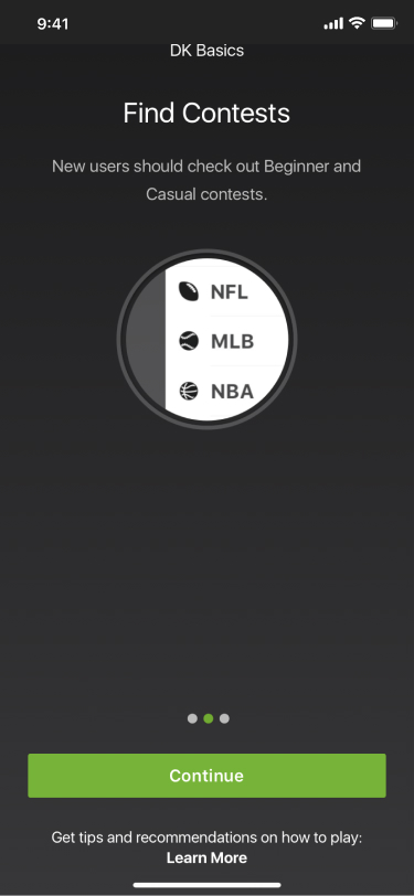
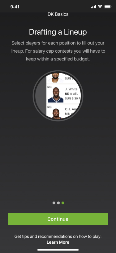
Replaced slides with instructional video. Much clearer, more visual, removes two unnecessary screens. Even if the user doesn't watch the video I created steps later to guide the user through creating a lineup.
Original Design
Redesign
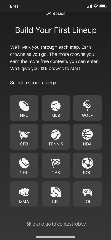
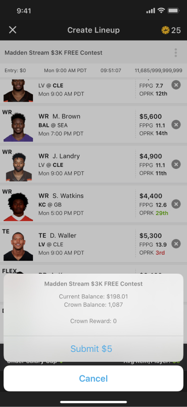
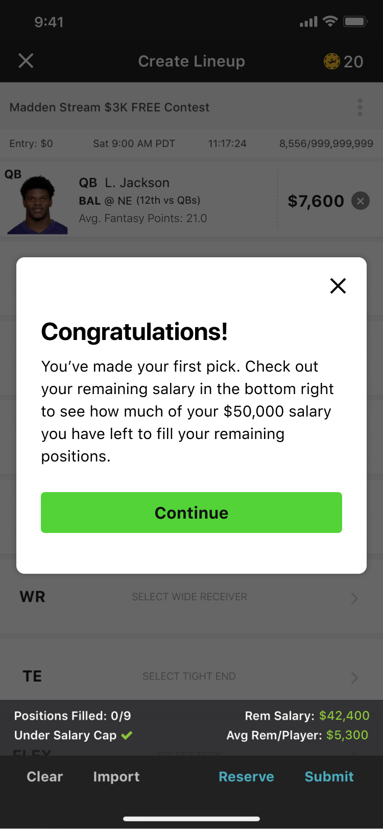
Gamified joining your first contest. Users will earn crowns as they build their lineup for the sport of their choosing. We use crowns in our rewards program, you can use them to enter contests instead of cash. When they finish their lineup they will have enough crowns to enter a contest for free. We're giving you something before we ask you for something.
Original Design
Redesign
Redesign
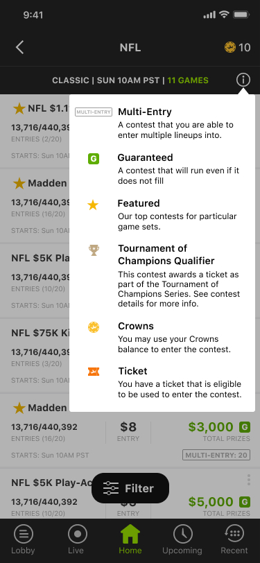
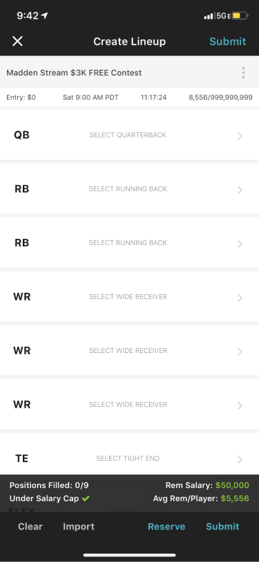
Clarified acronyms. Changed "M20" to "Multiple Entry: 20" so it was clearer to users. Removed "Sunday" since you'ce already chosen your day on the previous screen. In the top right corner you can see the crowns increasing as the user goes through lineup building. Also added a info tooltip to explain some of the other symbols on this screen.
Original Design
Redesign
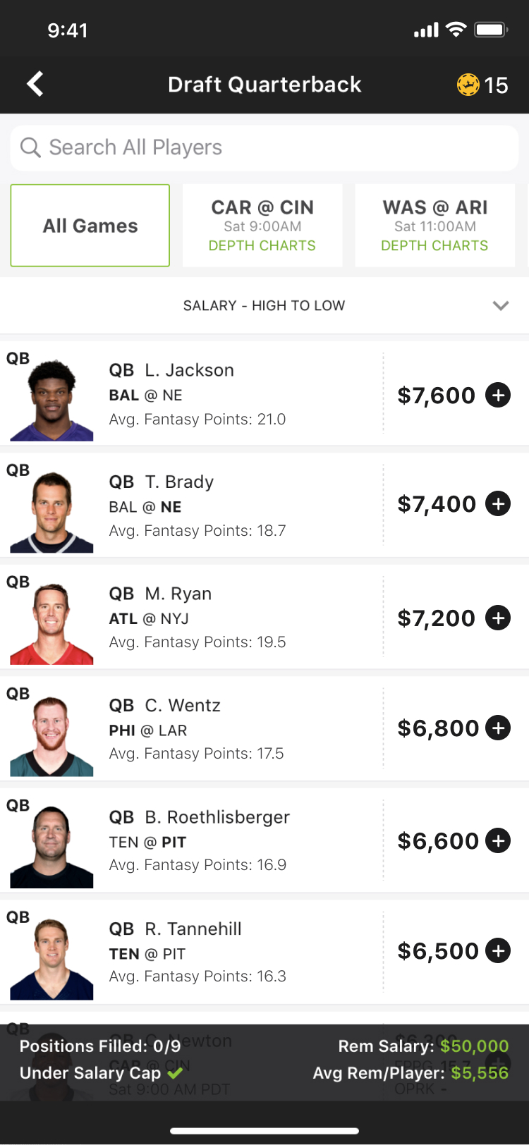
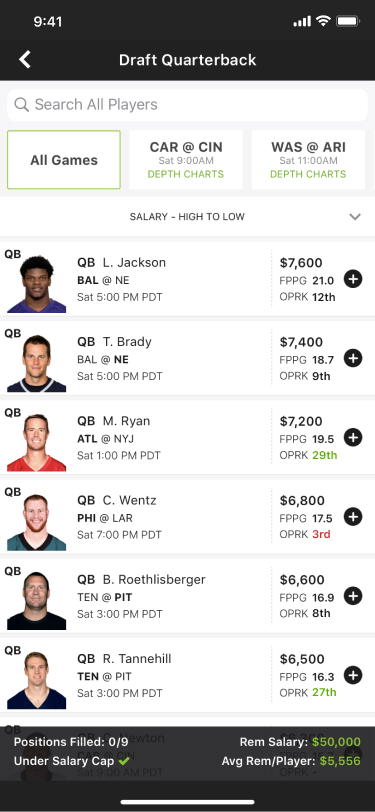
Clarified acronyms. Changed "FPPG", (fantasy points per game) to "Avg. Fantasy Points". For "OPRK", (opponent rank) we tried a few iterations of this but found that at the end of the day no matter how we displayed it, it confused more users than it helped, so we decided to get rid of it. After these changes 0% of users asked for these terms to be clarified which was a big improvement.
Original Design
Redesign
Redesign
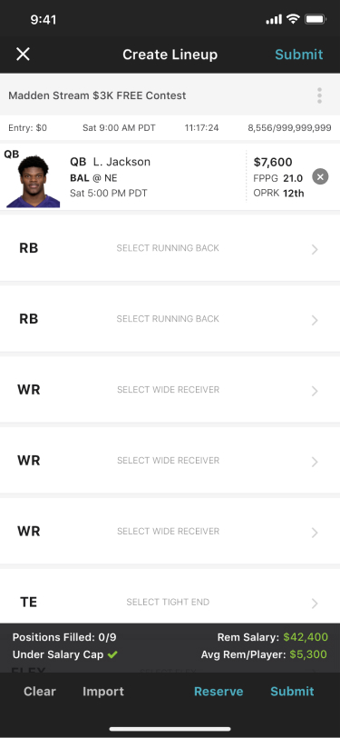
Added instruction. In case users didn't watch the video, this reminds them to pay attention to the salary cap while they pick players.
Original Design
Redesign
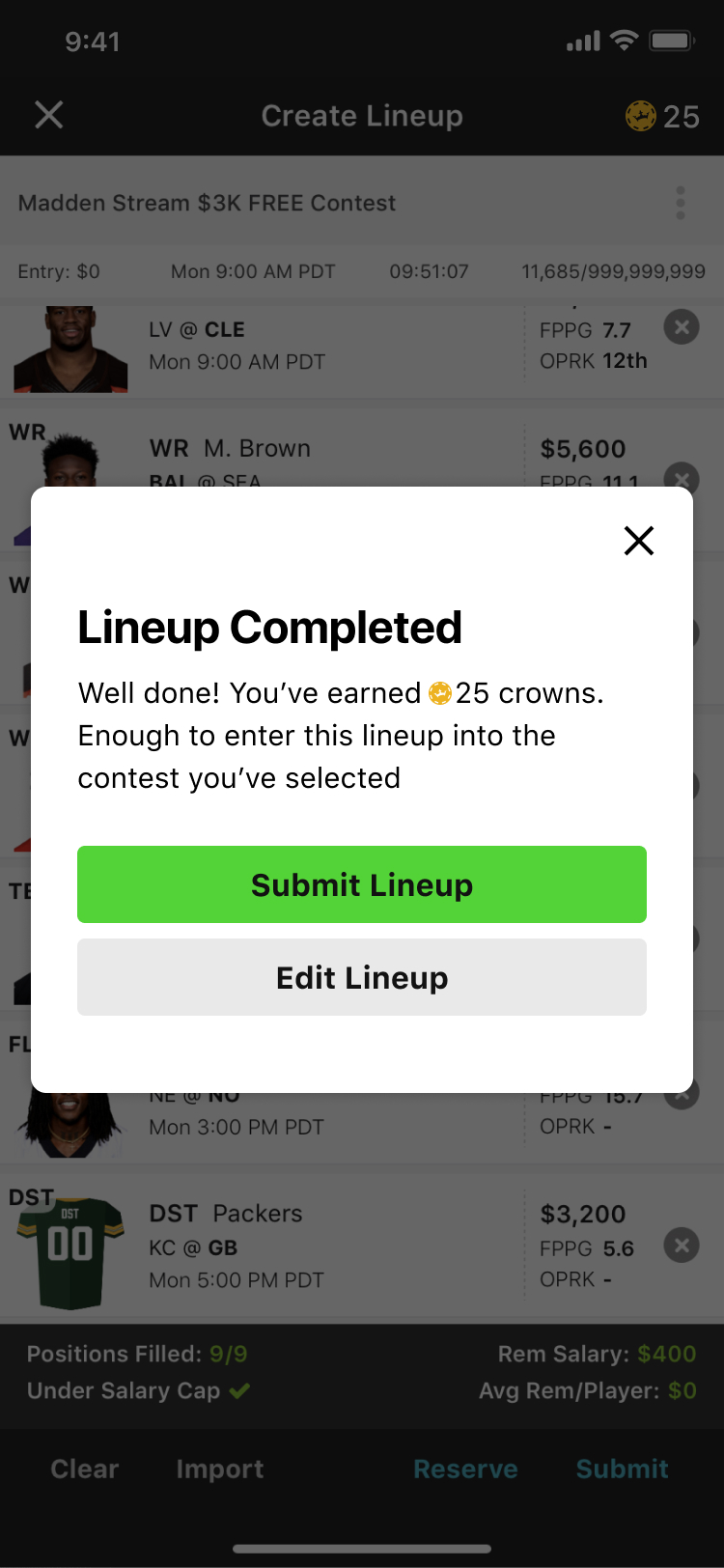
Added success message. Rewards users for finishing creating their first lineup by giving them enough coins to enter their first contest.
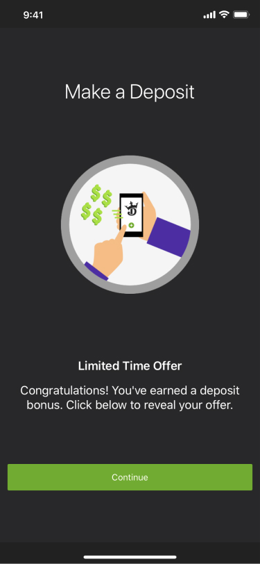
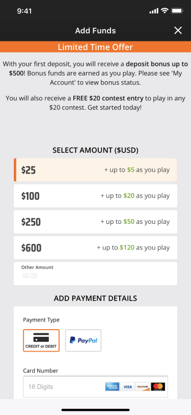
Original Design
Redesign
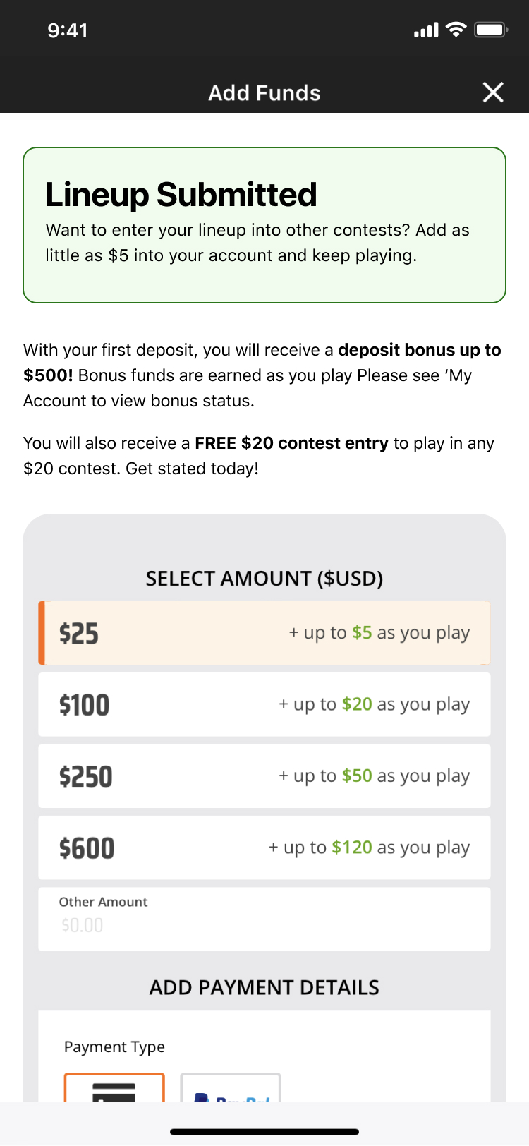
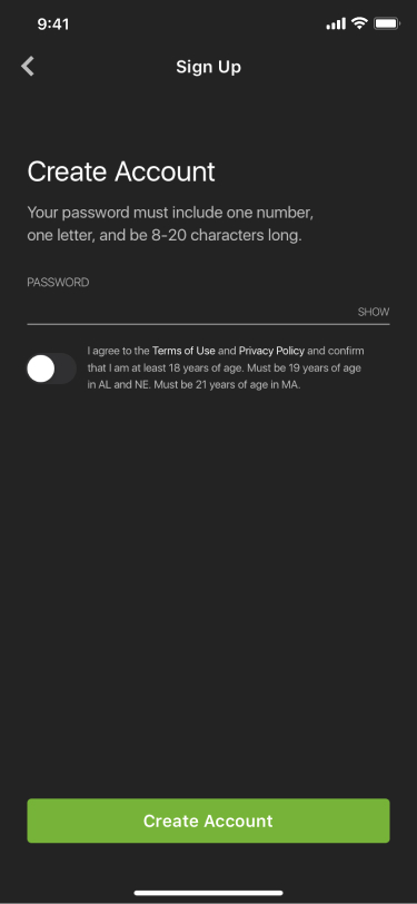
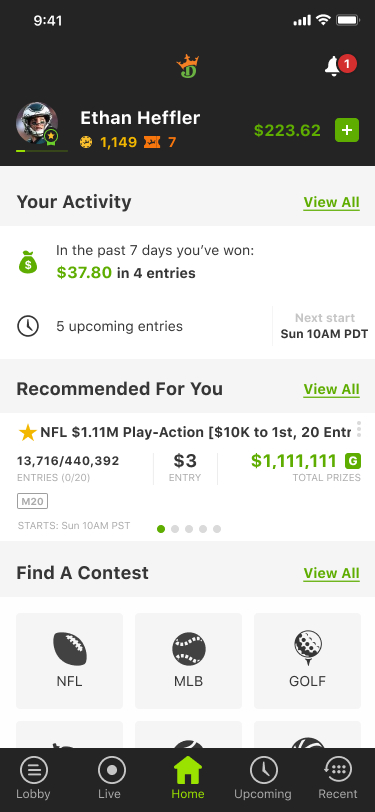
Moved deposit till after lineup submission. The user is now educated about the product, know where their money is going, and have understanding of how the contest/lineup process work. Now that the user knows all these things, we're in a better position to ask you to deposit money to enter this lineup into other contests.
We conducted another round of research to evaluate the impact of the redesigned screens. This allowed us to gather user feedback and ensure the changes effectively improved the overall experience.
- Users liked the gamification of entering their first contest and felt that they earned their first contest entry.
- Although some people didn’t watch the video and felt they could figure it out on their own, they had a good understanding on how the salary cap worked.
- No complaints about acronyms that had no explanation.
- Users liked having the flexibility to deposit or not deposit instead of it being mandatory.
- User quote: “Earning crowns was cool. Can I get more?”
- User quote: “I liked going back and forth between the players trying to pick the perfect mix of high salary big name players and longshots with a lower salary.”
User research of the redesigned flow was very positive. A/B testing of the updates to the flow was tested with 10% of new users and had a 39% increase in users staying in the flow. After this promising data we felt comfortable enough to roll it out to all new users. After 2 months we saw a 31% increase is users staying in the flow and entering a paid contest. Our goal was to increase by at least 25% so 31% is considered a big win. This project was a really amazing learning experience for me and the rest of my team and I'm very happy with how it turned out.