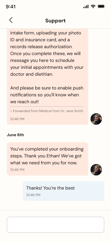
Patient Messaging & Routing
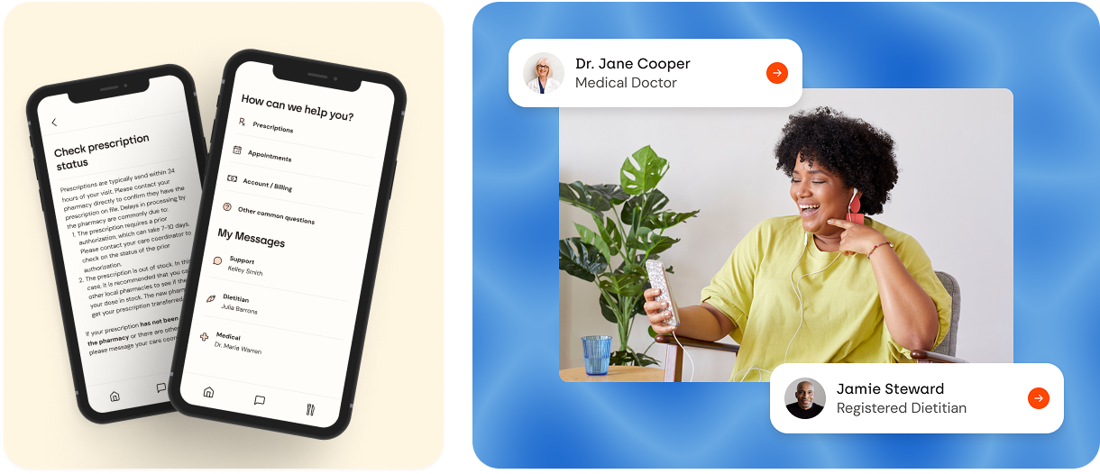
Form Health patients frequently had questions about their medications, appointments, and other parts of their care. Patients would ask their care team via chat through the app, but would often not know which member of their care team to ask, or didn’t realize they already had that information from a previous chat. We needed a way to route messages more effectively to help patients get their questions answered quicker, limit repetitive or unnecessary messages in chat channels and reduce the time that clinicians were taking to respond to messages.
Previously we just had a traditional chat similar to iMessage with chat conversations for medical, dietitian, and support. The intention of this was to have each category be responsible for certain categories of questions, but without any guard rails to keep that in place, there was a lot of inconsistency of what was asked in which channel.
We talked to some of our users to see what the pain points of the current messaging system were and what areas we should focus on for improvement. Here are the major takeaways from those user research sessions.
Prescription Refill & Status Clarity
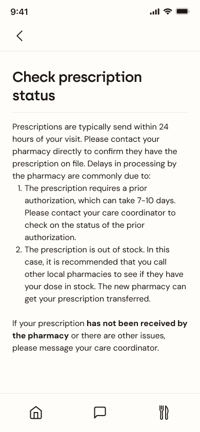
- Users expressed a need for clearer and more streamlined processes for prescription refills and status checks.
- There's confusion regarding where to find prescription information and how to request refills.
- Users desire confirmation of refill requests and status updates.
Communication & Support
- Users value the ability to communicate with their care team, especially their doctors and dietitians.
- Clarity on where messages go is needed.
- Users are used to using the messaging system for many functions.
Information Organization & Clarity
- Users want clear categories for different types of inquiries, such as billing.
- The interface needs to be intuitive and self-explanatory.
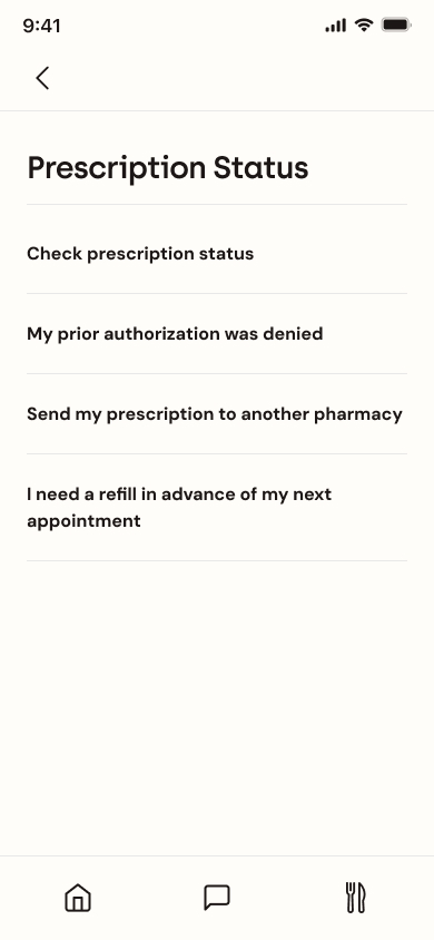
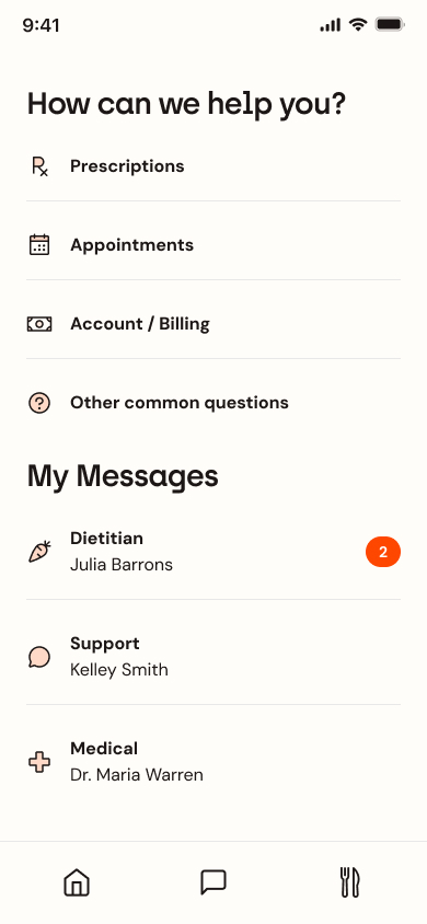
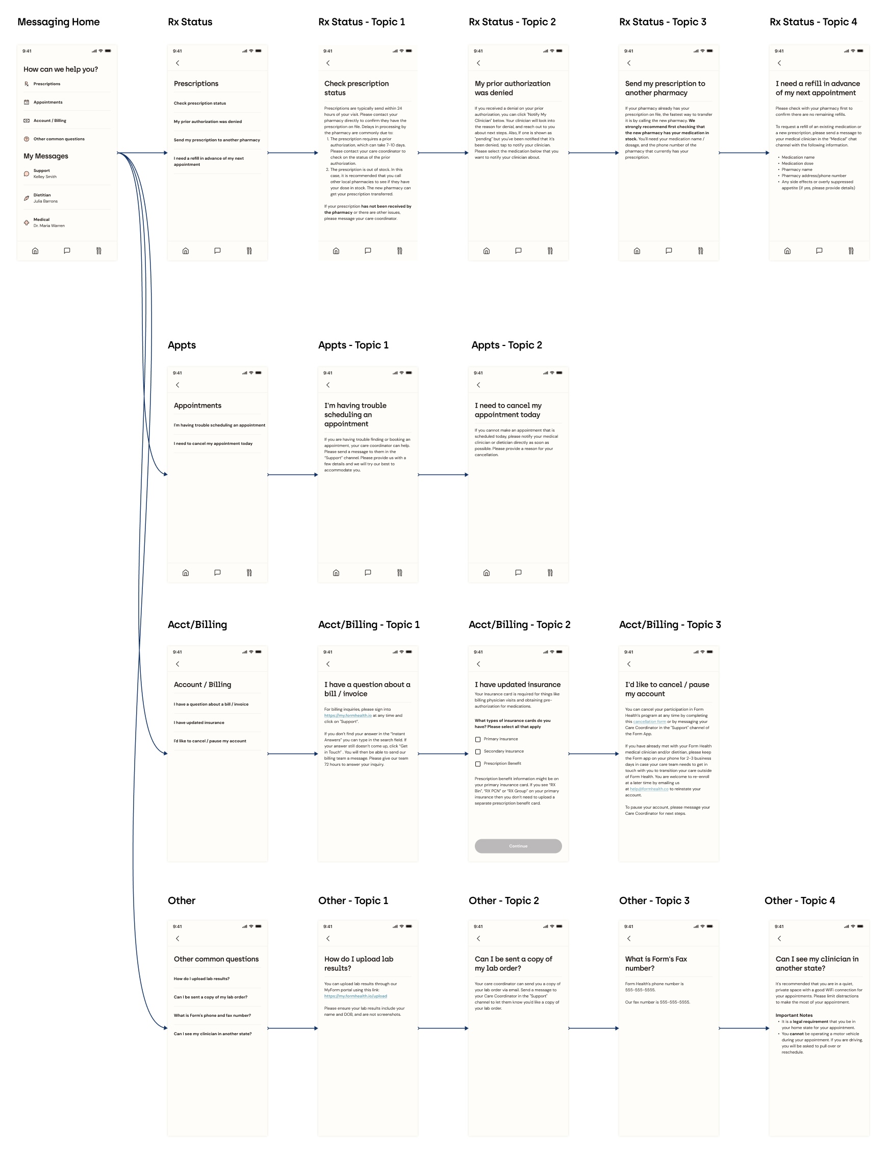
After reviewing the user testing results and talking to clinicians, we clearly needed a more streamlined process. The three areas that clinicians got the most questions about were prescription status, scheduling and medical records. The product team and I decided that we would have links to commonly asked questions in those three categories so that users could get answers to their questions quicker rather than asking clinicians. We used a product called Helpscout for support documentation so we could be add and edit these questions without needing to dedicate development resources.
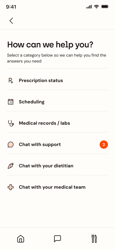
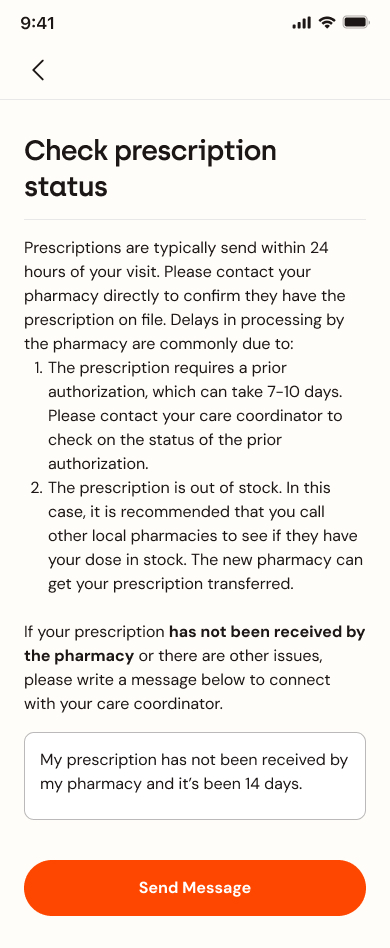
I reviewed these designs with the product team and other stakeholders. Althought they liked the designs, they thought the technical complexity that having interactions on the article pages like being able to send a message or select a medication you are on didn't add enough value to justify the amount of time it would take to build all those different interactions. So we decided to get rid of that functionality and just have it be text. If a patient needs to follow up with their care coordinator or clinician, that's what the chat is for, and it's linked in the footer.
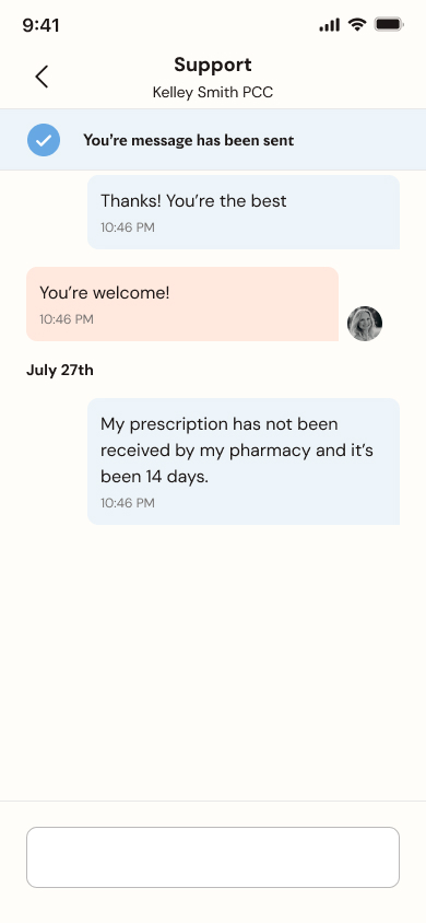
Another piece of feedback I got was to separate the chat channels and the questions categories to highlight that they are different things therefore should be labeled with different headings. Also to hopefully have the question links be the first option for patients and the chat be the second option if they have a question.
After implementing all the feedback and adding all of the content into the different screens I had a design that was ready to hand off to our developers.
This project successfully delivered a user-centric solution by directly improving the streamlining communication workflows, and creating an intuitive interface for both patients and clinicians. The implementation of this new design resulted in a 22% reduction in the average number of chat messages sent per patient and a 19% increase in the average number of FAQs viewed per patient, indicating a positive shift towards self-service and freeing up valuable clinician time.
Validated by positive user feedback during the design phase and these quantifiable improvements in communication patterns, this redesigned system demonstrates the power of research and iteration to improve communication clarity, boost provider efficiency, empower patient engagement, and optimize resource utilization. You can see this feature in use today in the Form Health app.