Dibbs Marketplace
Dibbs fractional asset market had not been doing the volume of trades that was expected, the product team was tasked with adding whole assets to the platform to increase revenue. The revenue model was based on transaction fees of 2.5%. so by adding whole assets ranging anywhere fron $500 - $10,000, that transaction fee would be drastically higher than the average fractional transaction of $50. We didn’t want our customers who were already on our platform for fractional assets to have to go competitors like Alt, OpenSea, Rarible, etc. if they wanted to purchase whole assets. We decided to give the marketplace a design refresh make it more user friendly and scalable for any kind of asset.
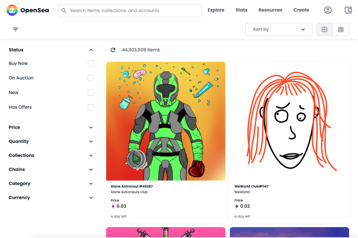
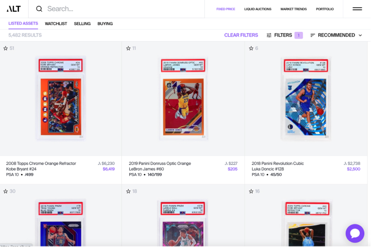
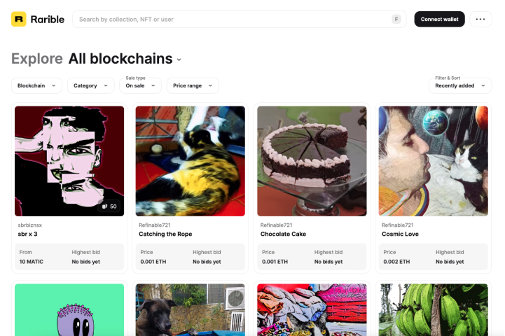
I looked at the competitors in the whole asset marketplace space to see what they were doing differently than us, take a look at existing patterns and best practices in the space. I wanted to research two different pages, the page where you discover the asset, which we call markets, and the page when you click on a particular asset, which we call the asset details page.
Markets
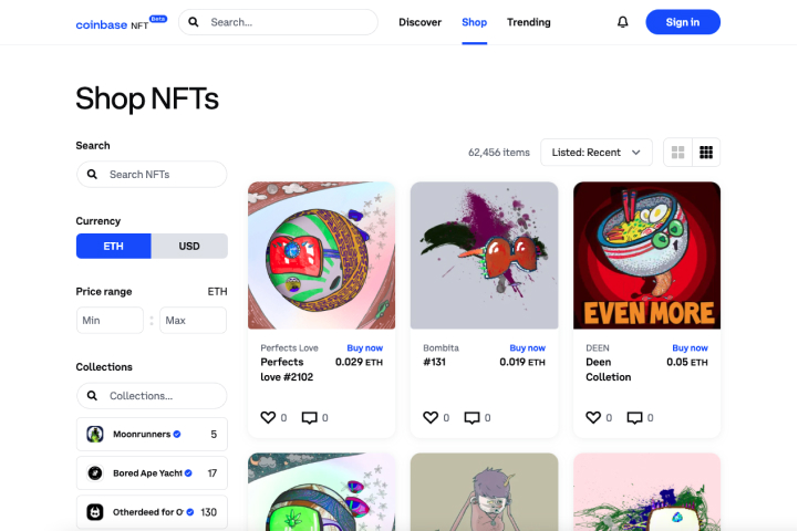
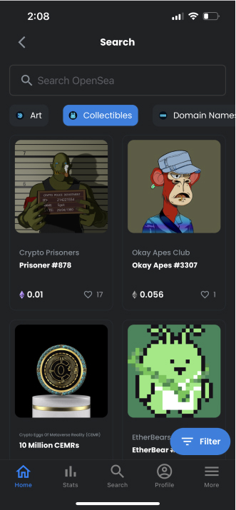
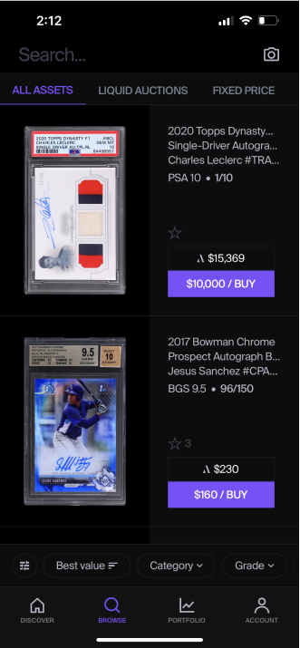
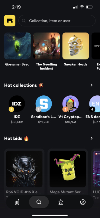
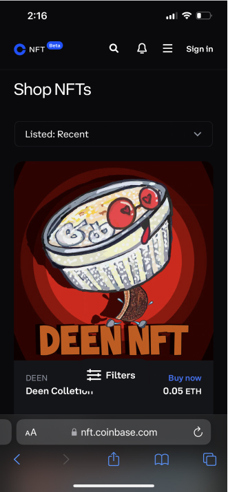
At first glance it was clear to me that the imagery of the NFT was much more prominent on our competitors sites and apps than on ours. The common elements in all of these are an asset tile with name and price, filter and sorting options
Asset Details
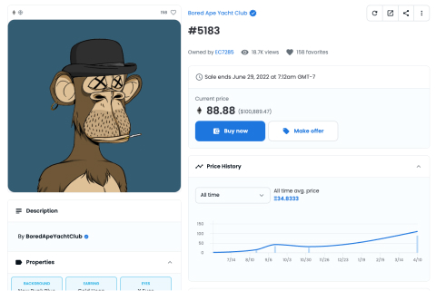
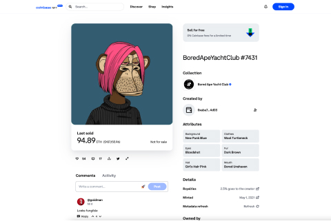
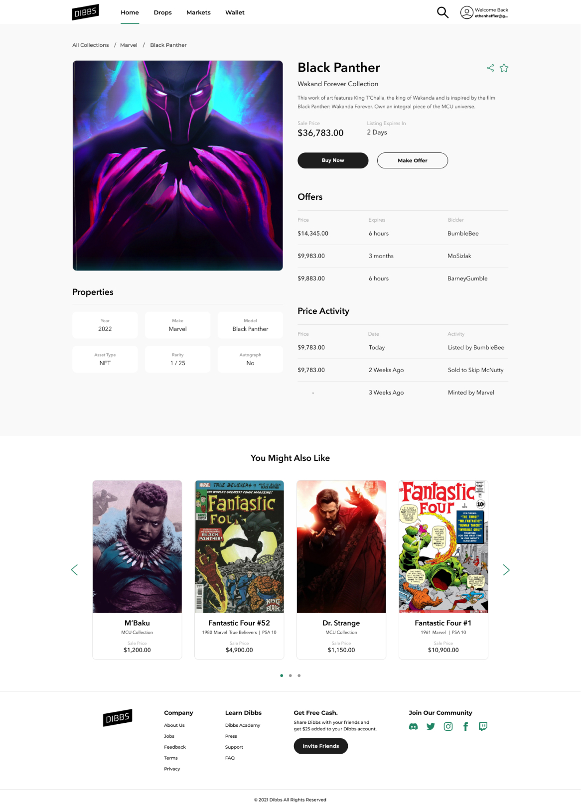
On the asset details pages, they all had a large asset image on the left and the data on the right, which told me they want the user to focus on the image first then look at the data. A well definied pattern that you see a lot of online


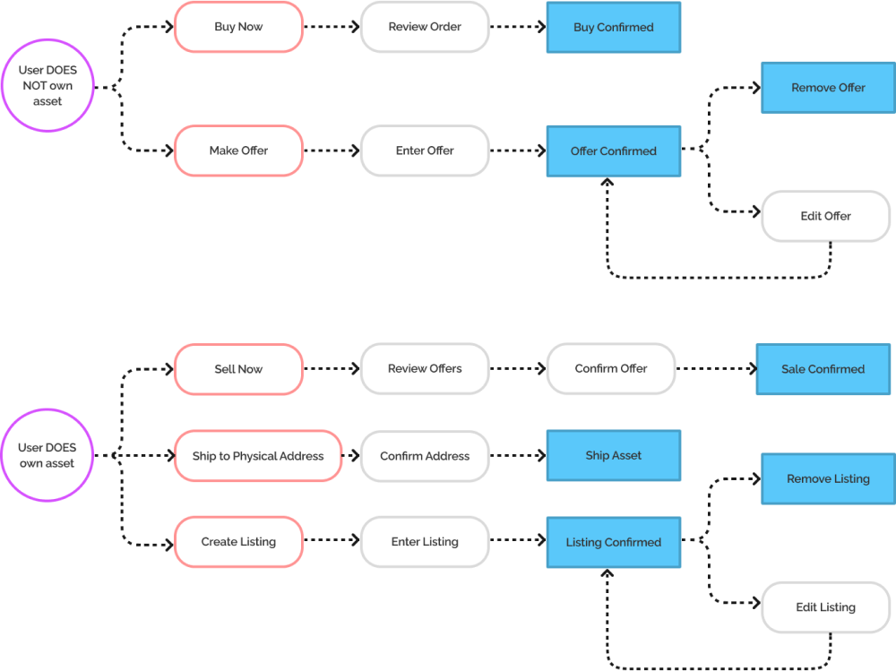
Before starting wireframes, I worked with our Project Manager, Tommy Massari, to figure out what the user flow on the asset details page would be so we could determine what information needed to be displayed on the screens. We had two starting points that we had to start from, users that own assets and users that don’t.
After taking a long look at the user flows, the competitive research, and talking to some of our frequent users, I dove into wireframes. This is where the ideas we came up with as a team started to take shape.
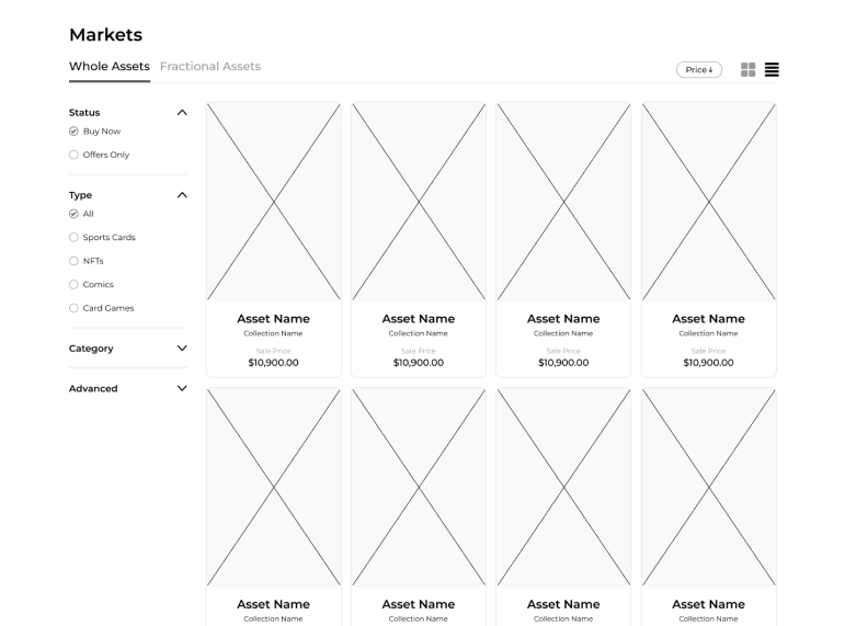
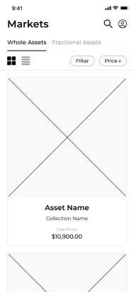
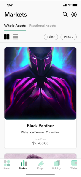
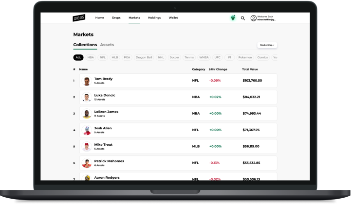
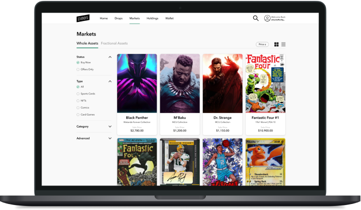
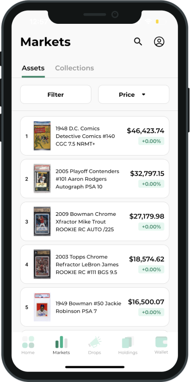
Markets
For the markets page, we decided to have tabs at the top of the page to have a clear separation between whole and fractional assets. Then we decided to use a classic design pattern in ecommerce of having filters on the left and page sorting in the top right. It’s a pattern that users are already familiar with, making it more of a frictionless experience.
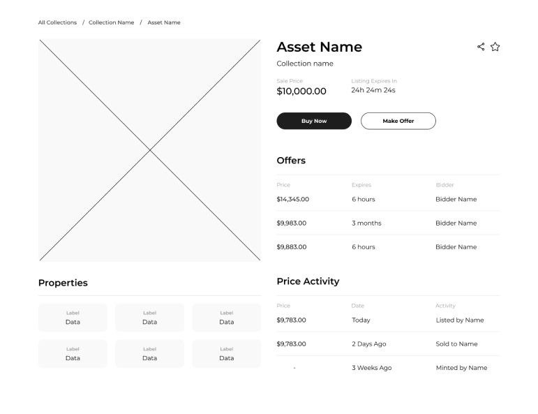
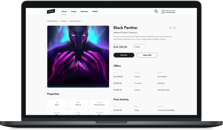
Asset Details
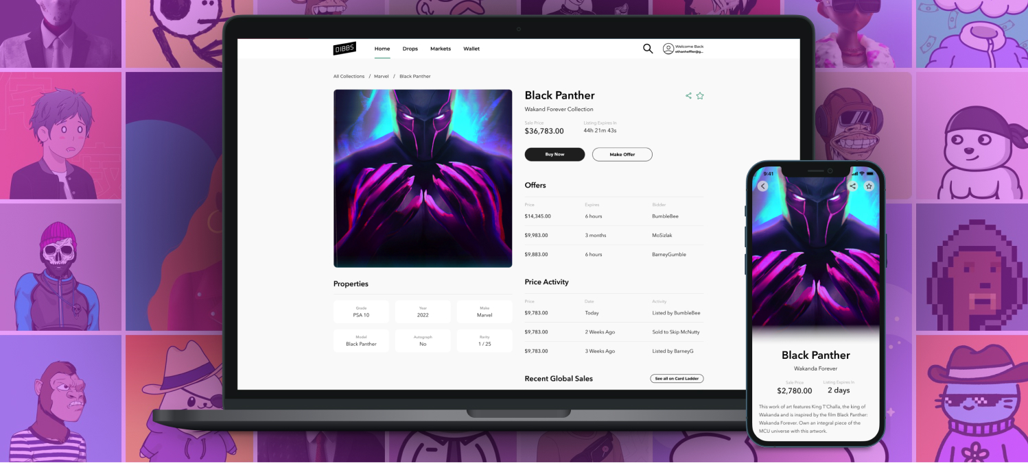
We determined that the main sections on the asset details page that would be most impactful to our users would be the asset image, properties, asset name, offers and price activity. I made the two sides of the page equal width which allowed us to make the asset image and the data have equal prominence. Our previous design had the image column much smaller and we wanted to get away from that.
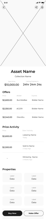
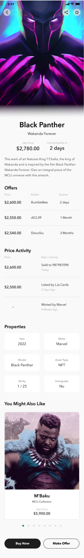
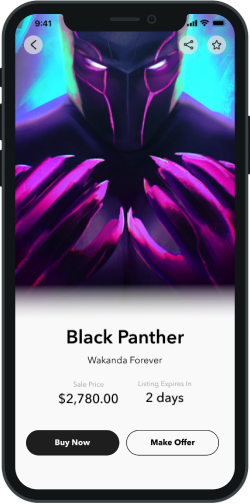
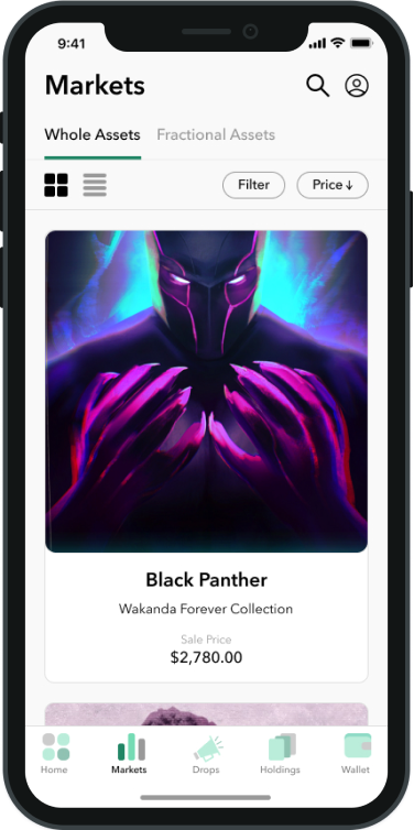
After an internal review of the designs, one of the founders of Dibbs pointed out that something felt "messy," though he couldn’t pinpoint why. I suspected it was the font and the inconsistent weights and sizes. Inspired by the clean look of Avenir from the Acorns app, I opted for Avenir Next for its improved letter spacing and reduced the variety of font sizes and weights. The result was much cleaner, and the feedback confirmed it felt right. I also iterated on the mobile view, introducing a full-screen image with centered asset info for differentiation and added a section at the bottom to upsell related assets. After another review, the updates received rave reviews, and we got the green light to begin user testing.
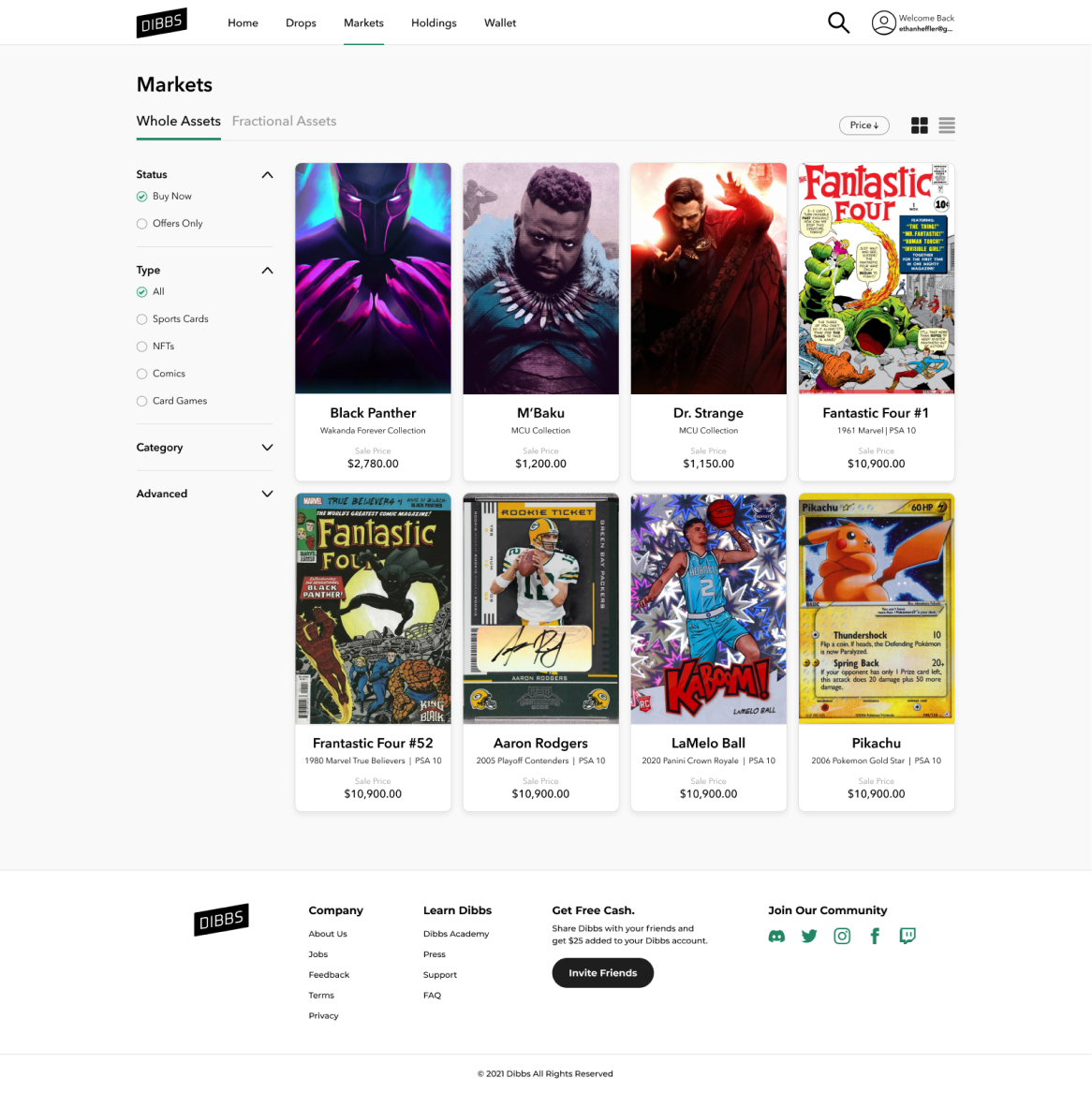
Markets
Asset Details
Before & After
To better understand how users interact with the updated platform and what questions they had, we had 10 existing users look at the new designs and give feedback. Our hypothesis was that users would like the new images, understand the offer system vs. buying now and would like the option to buy whole assets in addition to fractional assets.
- 10/10 Loved the new larger image. I was not surprised by this since wanting more emphasis on the image had come up in previous user testing.
- 10/10 Understood the offer system and said it’s very similar to making a limit order for a fractional asset which is already on the platform.
- 8/10 Would prefer to make an offer vs. buy now and try to get a better price if they can.
- 6/10 Would buy whole assets over the fractional ones but would prefer assets under $2,000. The other four still preferred fractional becuase they preferred less equity in more assets than having it all in one asset. This was fine by us becuase we still wanted the fractional market to have a lot of active users.
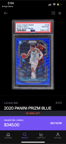
- Bonus Data 3 users said they prefer the properties section having more of the asset data to the long asset title we previously used. For example, a previous long title we had was “2016 Bowman Chrome Green Refractor Juan Soto ROOKIE RC AUTO /99 BGS 9.5 GEM MINT.” Way too long. In the new format it would just be, “2016 Bowman Chrome”.
I’m extremely happy with how this project turned out. Looking at the before and after shows a huge improvement to the visibility of the image and information heirarchy. Our two goals, modfiying these pages to accomodate whole assets as well as fractional and giving it a fresh new look were both achieved. Stakeholders were very pleased with the outcome as well and are looking forward to it being released. Unfortunately the project was ultimately shut down before launch as the company pivoted to a new business model being more of a Saas company than a direct to consumer company.