PFF Design System
When I started at PFF, the top priority was cleaning up the overall design of the app and creating a design system to keep those design patterns consistent. The fonts, colors, spacing, components and overall feel was inconsistent and needed a refresh across the app. I had built two other design systems over the last few years at DraftKings and Dibbs so I knew exactly what we needed to do to get this design system started, but first we needed a game plan.
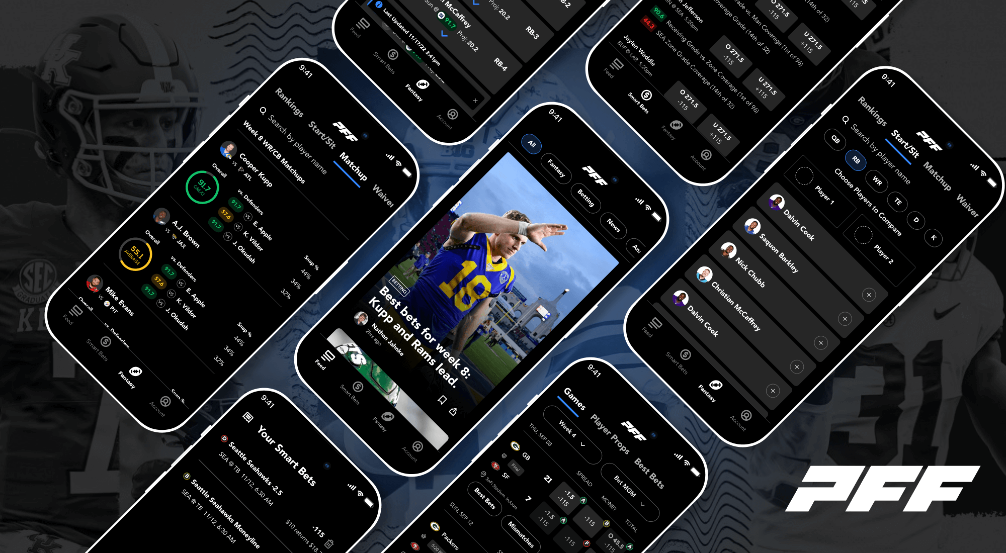
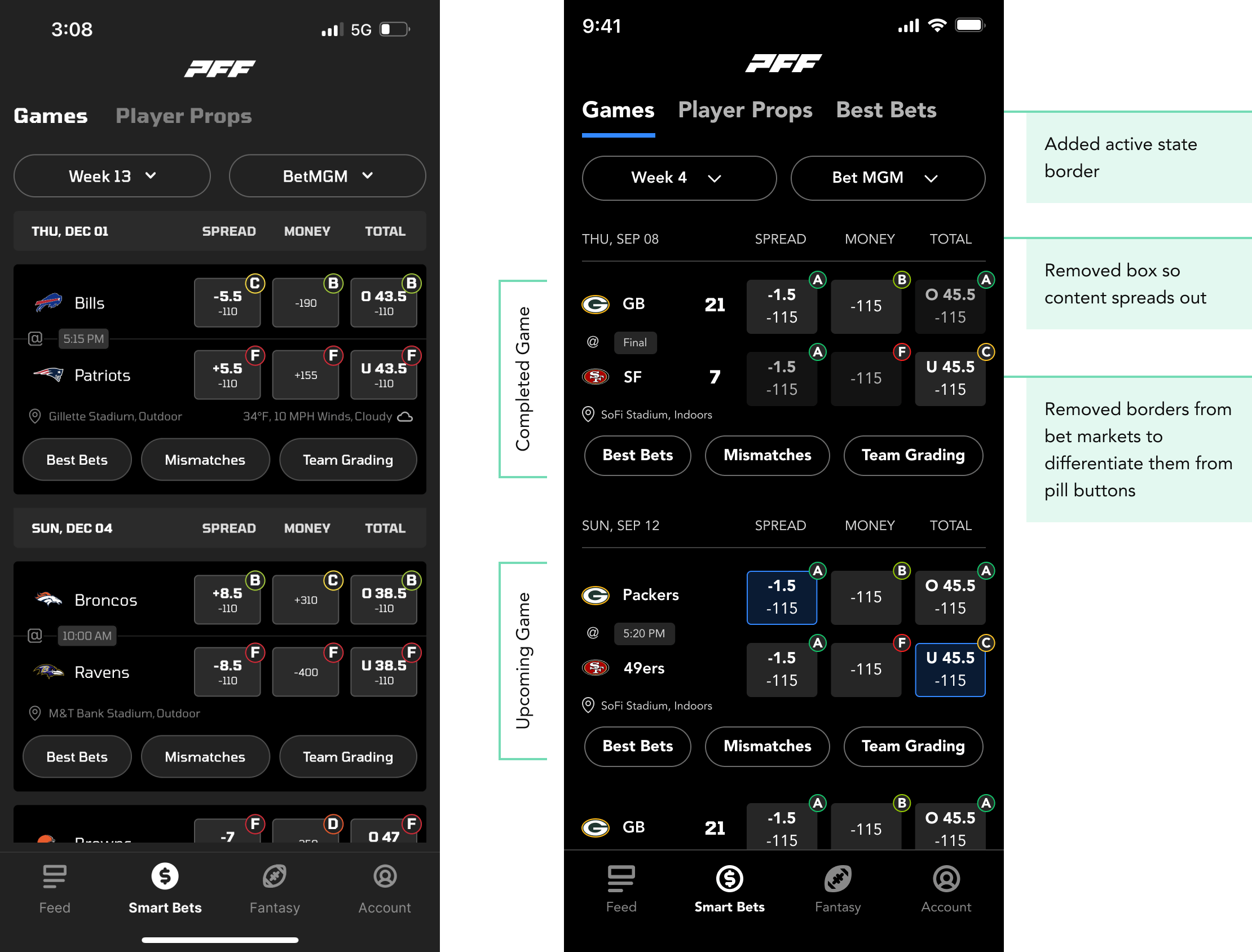
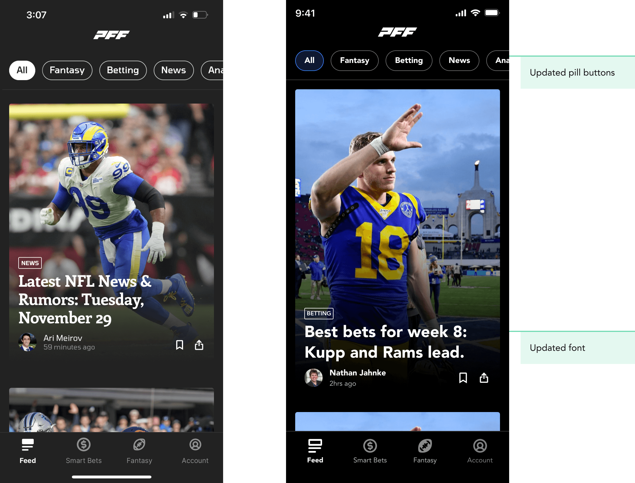
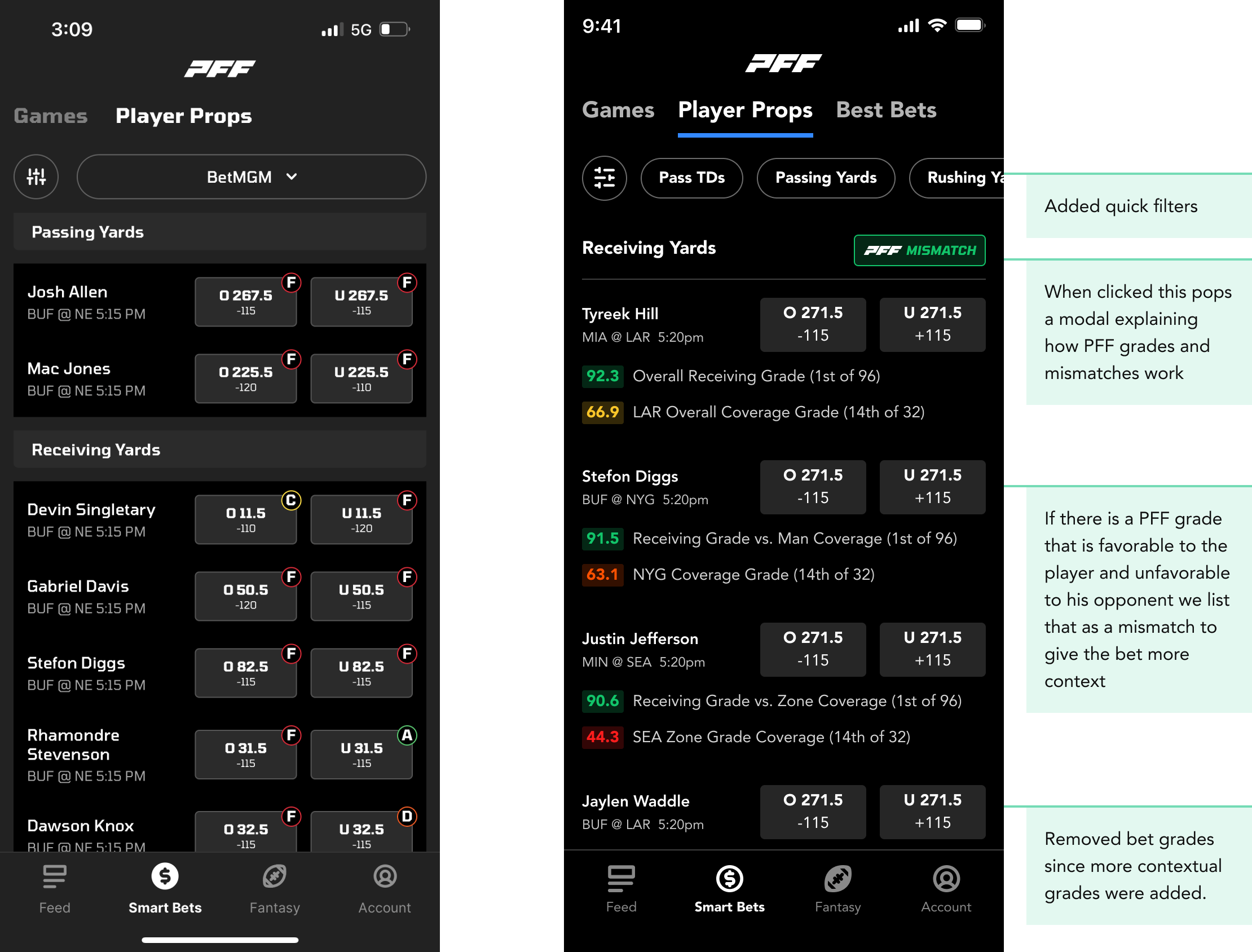
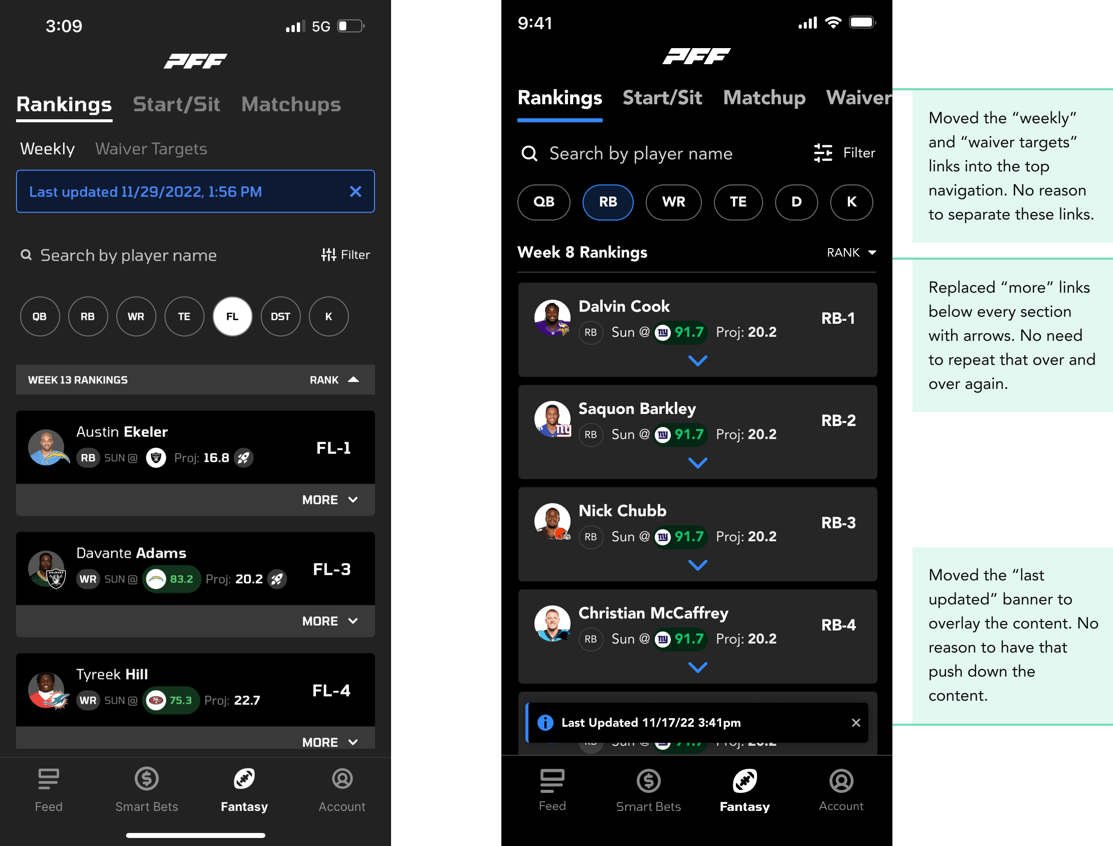
We took a long look at the app, dissecting what needed to be improved, what needed to be made more consistent and what needed to be changed completely. These 4 screens illustrate what some of the issues were.
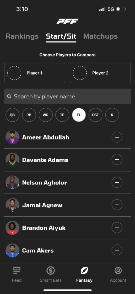
- Lack of color - Most elements are black, white and gray.
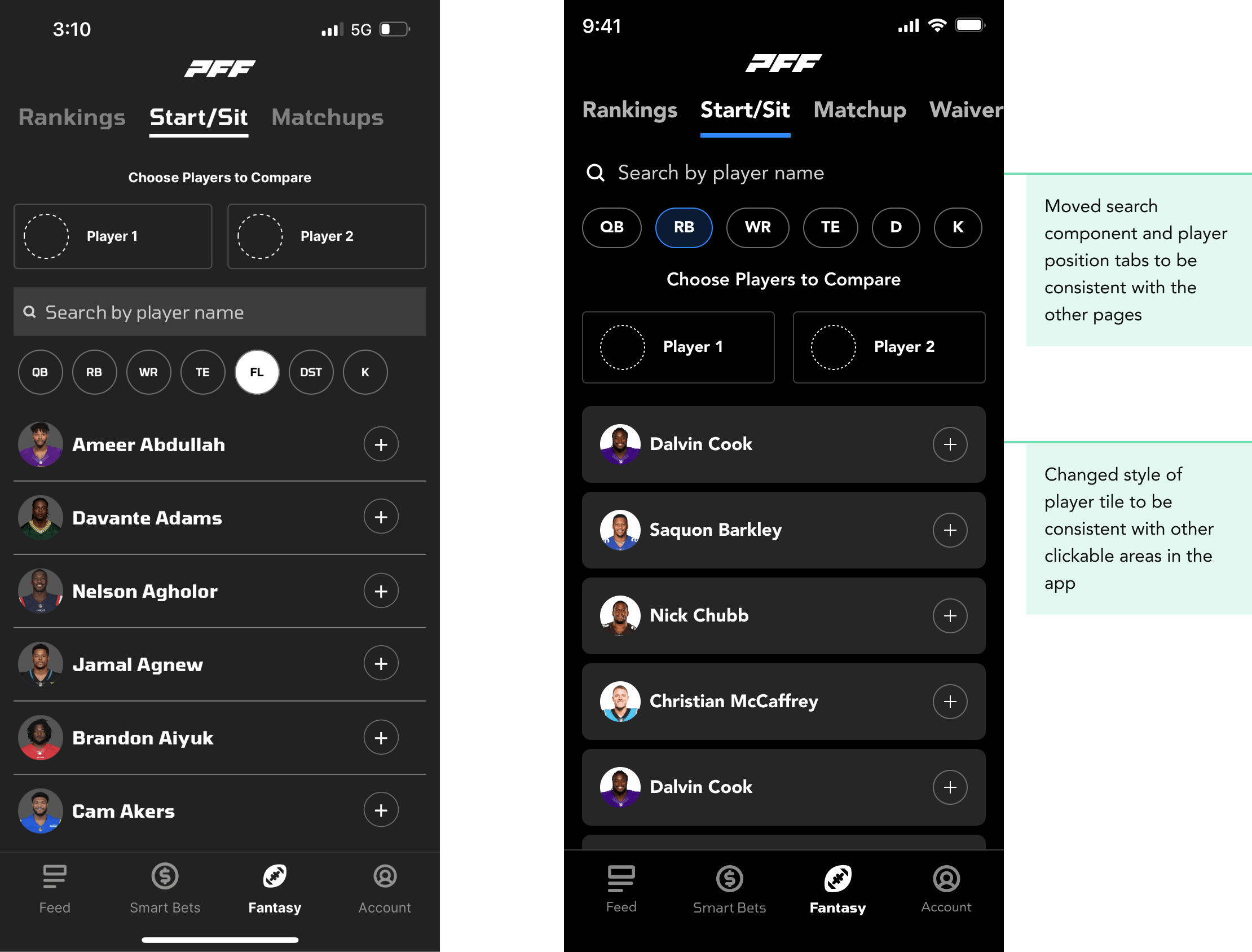
- What’s clickable? - Inconsistency of what is and isn’t a clickable element came up during user research. Buttons, clickable areas and links were not consistent and there were sections of the app that users didn’t know they could click into.
- Too many boxes - This box, inside a box, inside a box design reduces the amount of space for content since you need padding inside every box. If we get rid of this design pattern there will be more room for content.
- Font needs to be more readable - The previous font worked for numbers and resembles the type of font used for scoreboards but not great for content readability.
- Inconsistent design patterns - Search fields are in different places on the screen and styled completely differently. Some active text elements are underlined and some aren’t. There were a lot of different elements like that that could be cleaned up and made more consistent.
We researched several fonts that we thought we be a good fit and tested out what they would look like in the app.
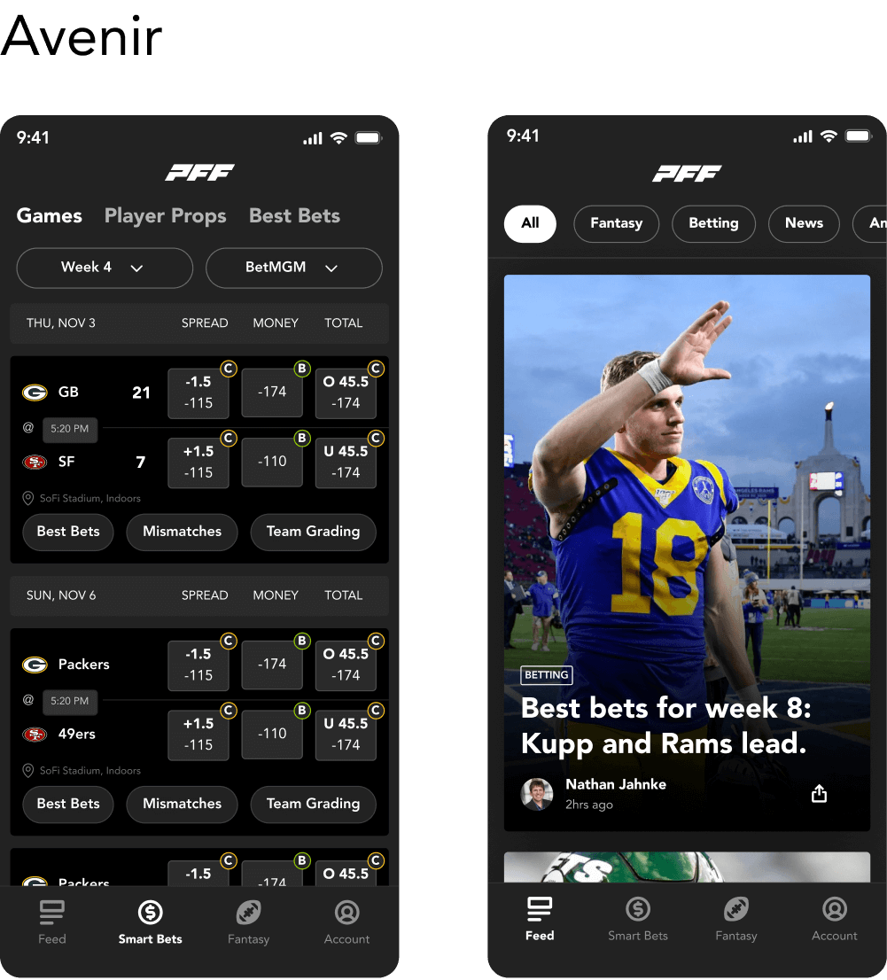
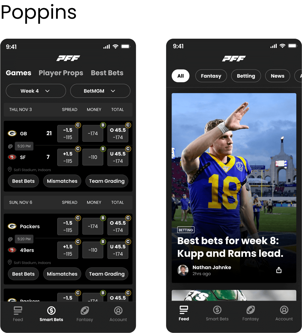

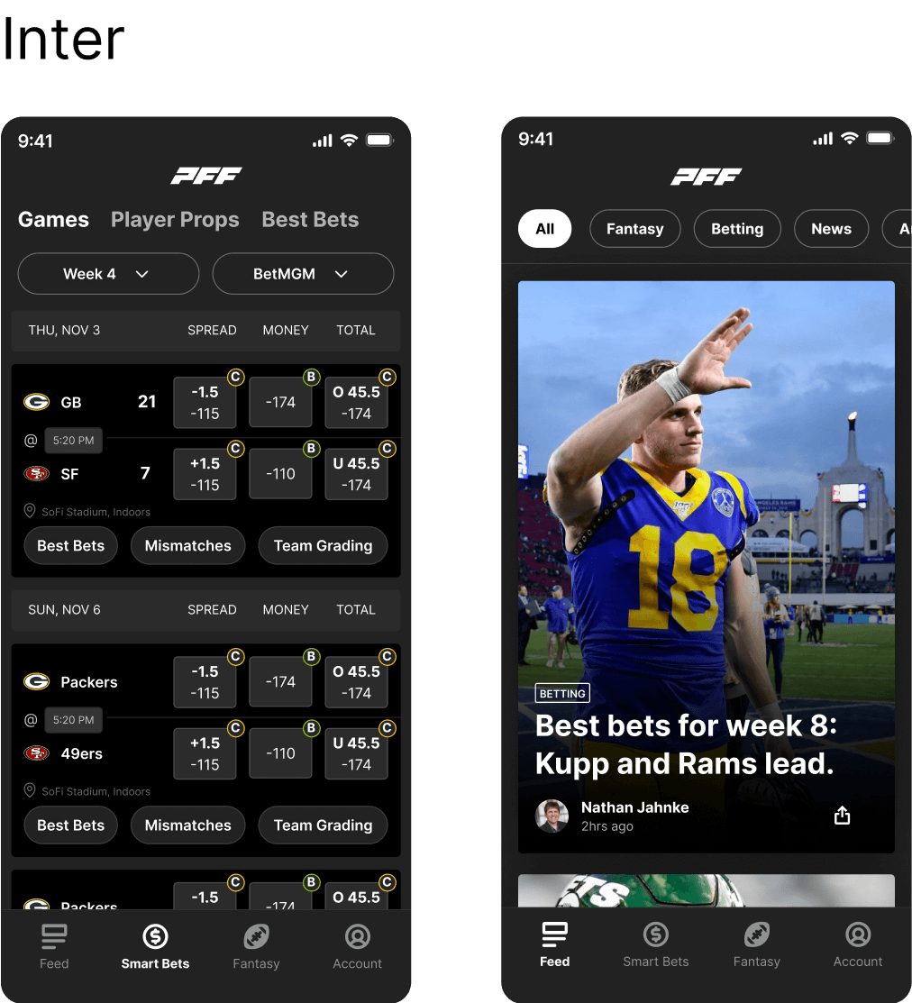
Now that we had some options to choose from, we showed them to the stakeholders and had them vote on which font they thought would fit best in our app. We found an extremely useful Figma widget for this called Alignment Scale that let people vote for different designs anonymously in Figma. Here are the results.
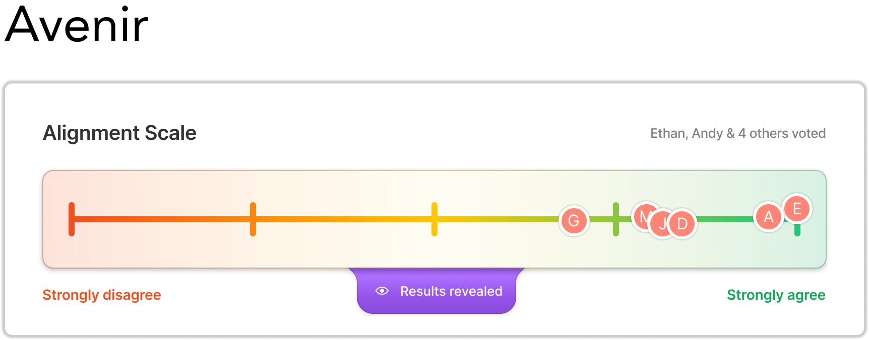
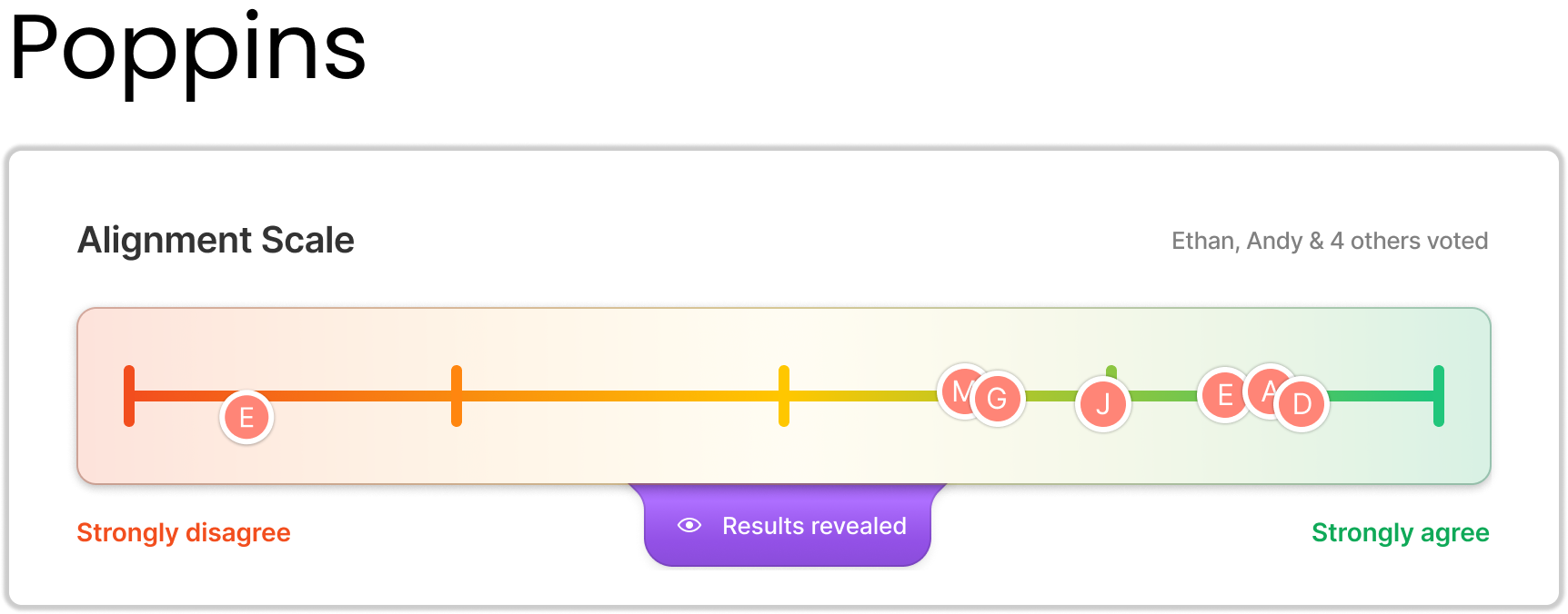
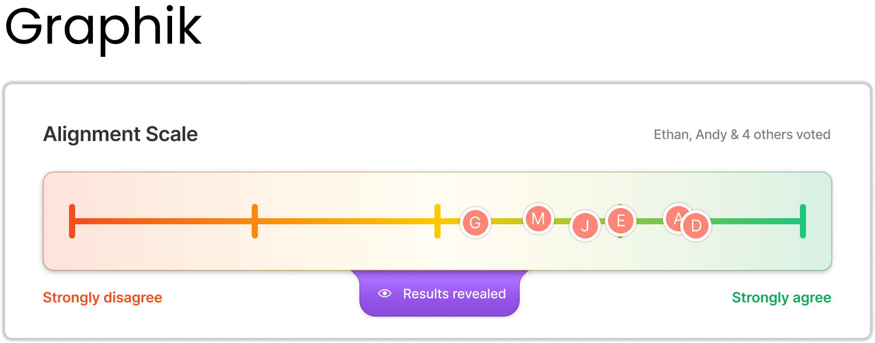
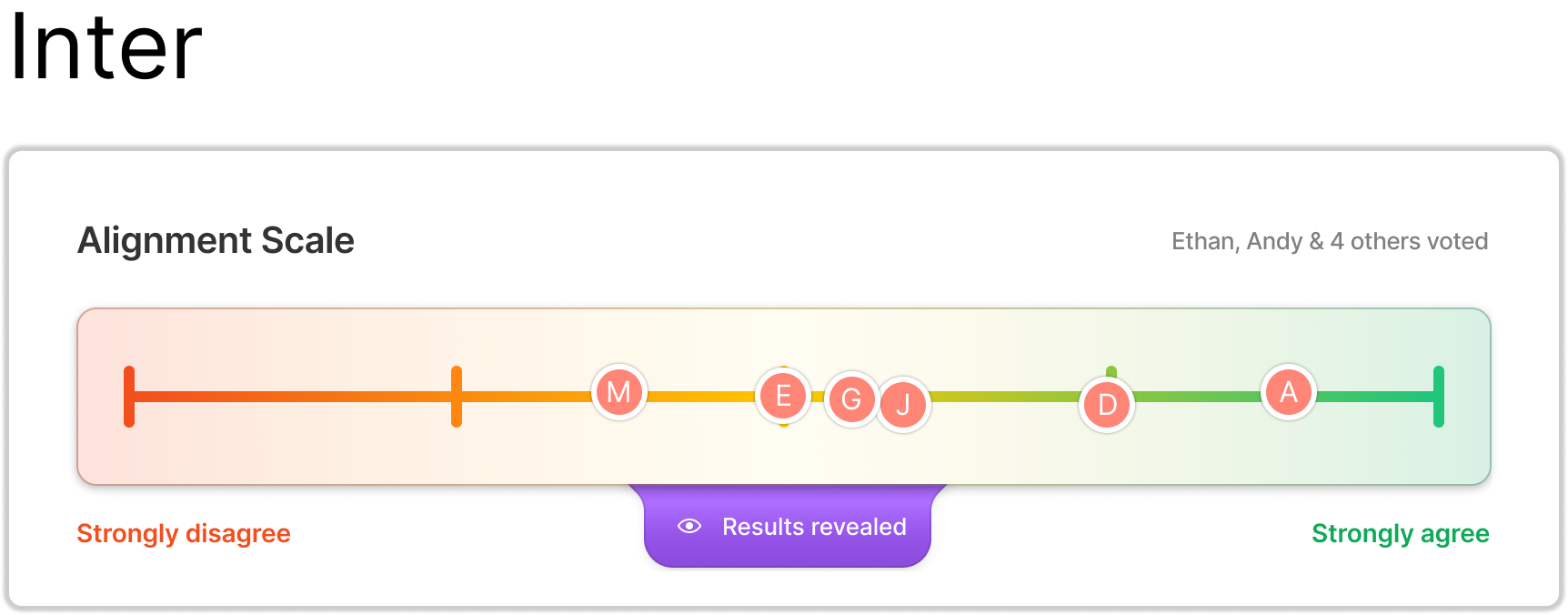
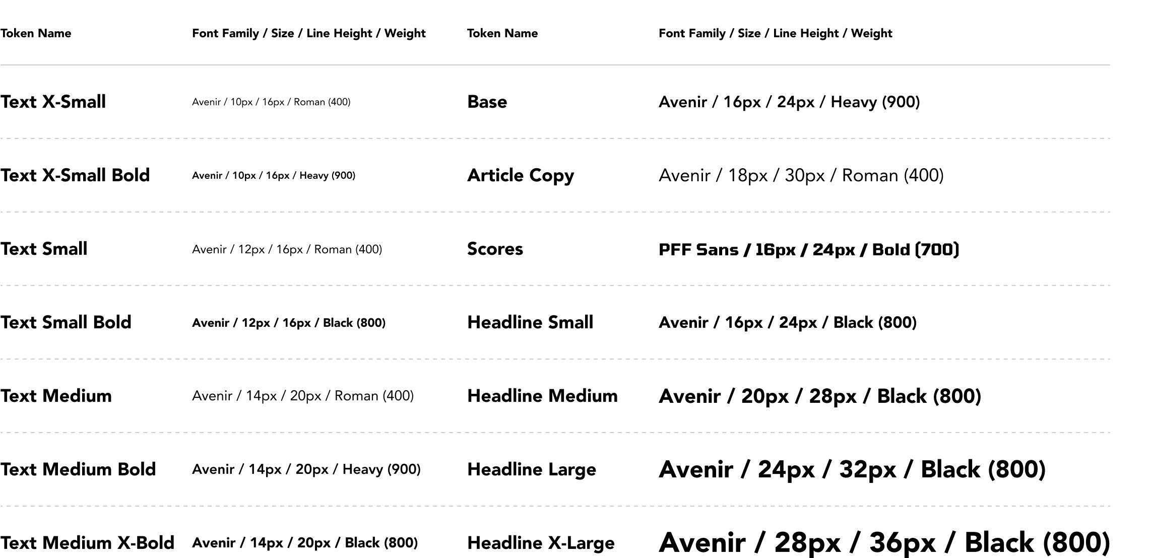
It was a tight race between Avenir and Poppins but in the end, Avenir won. We then created typography tokens based on the content we currently had in the app. Typography and color tokens are immensely useful for both creating a consistent experience for our users while using our app and for the developers and designers building it. We implemented these tokens in both Figma and in storybook so developers and designers would be on the same page and are speaking the same language when referencing these fonts.
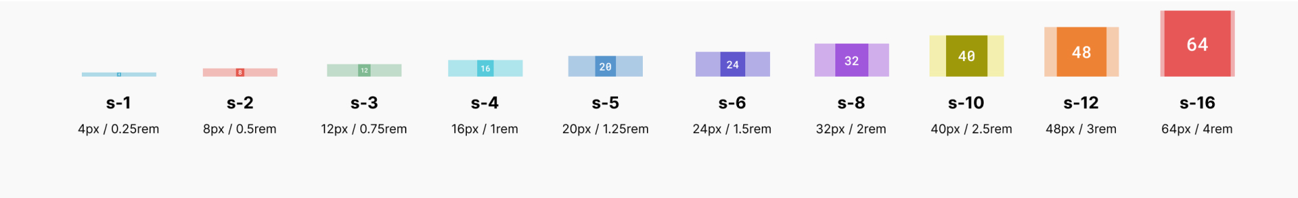
To make the design patterns we’re using have visual harmony and consistency throughout the product we needed to establish spacing rules before starting the components. Since there were a lot of situations where we needed to use 4px of spacing to fit elements on the page, and our base font was 16px we decided to go with a 4px spacing system. I created these spacing tokens below for the developers to implement in their codebase to make design handoffs more seamless.
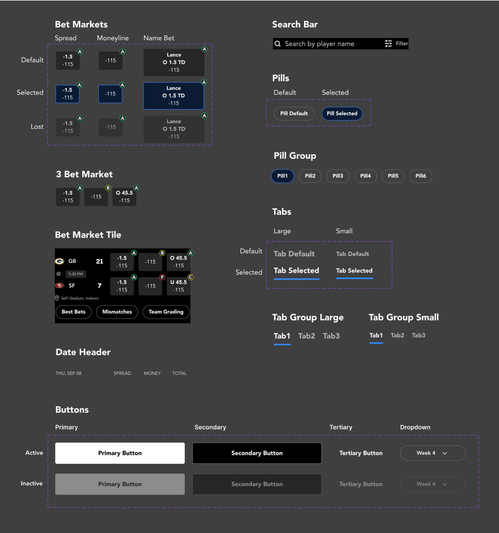
I then went over all the designs and found the most commonly used components we needed. The components with purple outlines around them indicate that these are variants of one component. This is a very useful feature in Figma that allows you to group variations of one component together to reduce the amount of components and also toggle between options very easily.
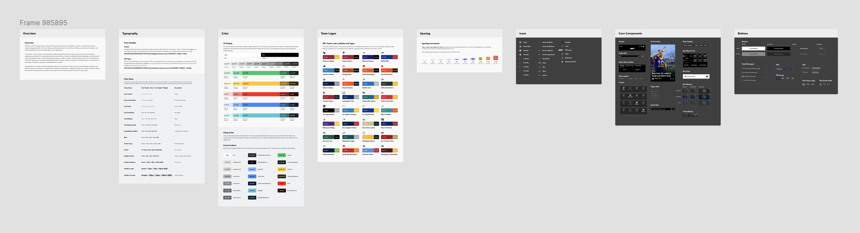
Now that we have everything set the only thing left to do was build out the rest of the design system. That included adding more components, buttons, icons, adding color combos and team icons for all the NFL teams since that was something we needed on a regular basis. You can see the full design system below and view the Figma file here.
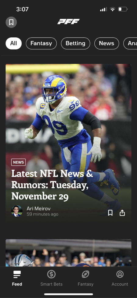
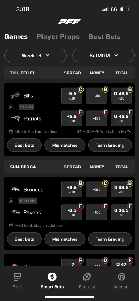
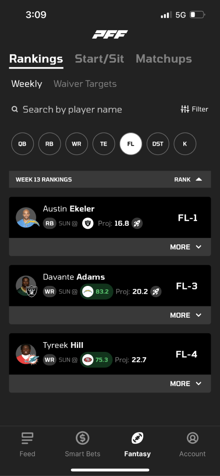
Here's a few screens to show before and after we updated all the colors, typography and components.

After completing all these steps we had a functional design system for the designers as well as a matching component library in storybook for the developers. This made working on the app incredibly faster with way less time spent on iteration and handoffs since everyone was speaking the same language and was working out of the same toolkit. This enabled us to be able to release more features per quarter, improve the experience in the app for our customers and get the app to a level of greatness we knew it could be.