Frac Packs
Think of opening a pack of baseball cards and not knowing what you’re going to get. Frack Packs was a similar concept but instead of whole cards it was different fractional amounts of cards. 1% of this card, 2% of that card, etc.
One of the KPIs (Key Performance Indicator) on our product roadmap was increasing recurring deposits week over week by 20%. The team agreed that selling frac packs would be a good path to achieving this goal. Users had already asked for this, and chance mechanics (aka “unboxing”) has been a proven engagement and monetization mechanic. We all agreed as a product team that this was something we wanted to explore.
These designs were already in place when I arrived at Dibbs and were definitely on my list of pages I wanted to improve. The biggest issue is that there’s no explanation of what a Frac Pack is. User testing showed that users didn’t how Frac Packs worked until they went through the pack opening process. That wasn't a good UX needed to be changed. There was a ton of unused space on these pages that could've be used to make the card larger or add more info about each card. Also all the fonts are the same size and font weight so there is no heirarchy of information. In summary, there is a lot of room for improvement.


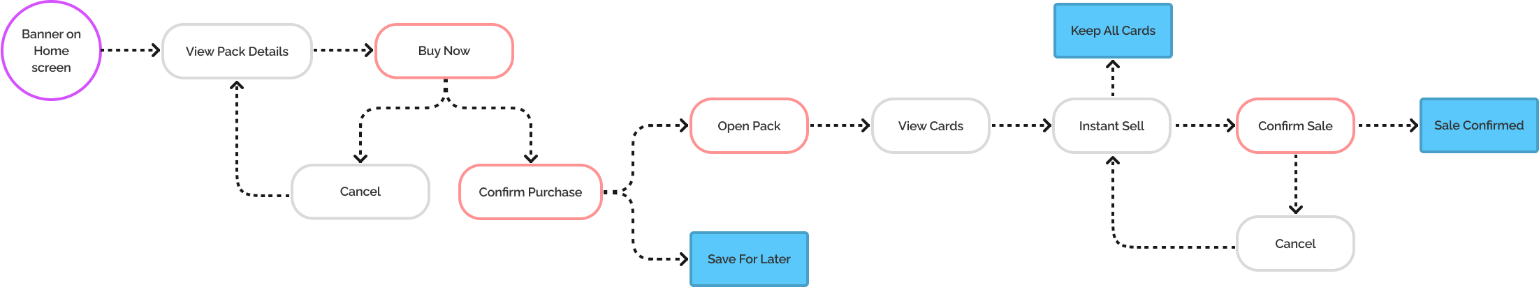
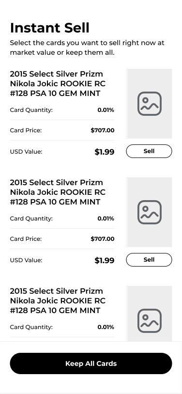
I worked with our Project Manager, DJ Collins, to figure out what changes to the current user flow we would need to account for since users will be buying these packs instead of just getting them after depositing. In addition to the purchasing flow, we wanted to add the ability for users to have the choice to sell their new cards instantly after viewing them. Since our data showed users often sell some or all of the frac pack cards directly after opening them, we wanted to make that process easier for them.
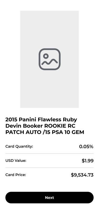
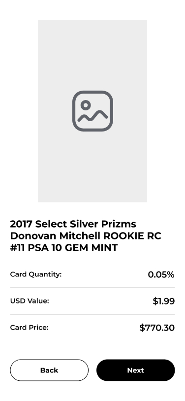
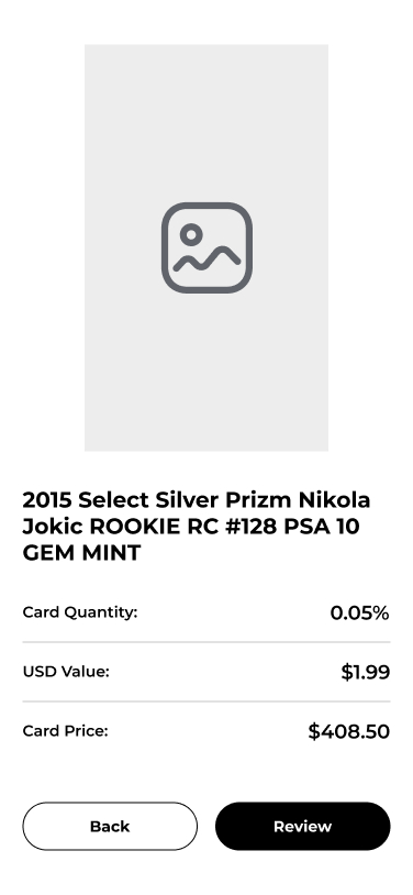
After looking a long look at the issues I wanted to fix on the current designs and the updated user flows, I began wireframing. The first thing I wanted to do was to explain what a Frac Pack was and making it crystal clear what the user was going to get when they purchased one. This needed to include an explanation of what would be in the pack, what the chance mechanics would be and what the best possible card could be.

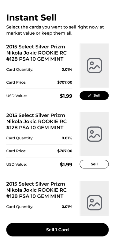
Next was addressing all the empty space on the card pages. I made the card image much larger since users had been mentioning they want to see more detail of the cards. I also reformatted the ownership and value info to be more easily read, and added in the total card value to give more context.
Lastly, I had to figure out a solution for the user to choose whether to keep their cards or instantly sell them. I decided to just make a minimized version of the previous card pages since all of that information would still be relevant in making the decision whether to keep or sell it.

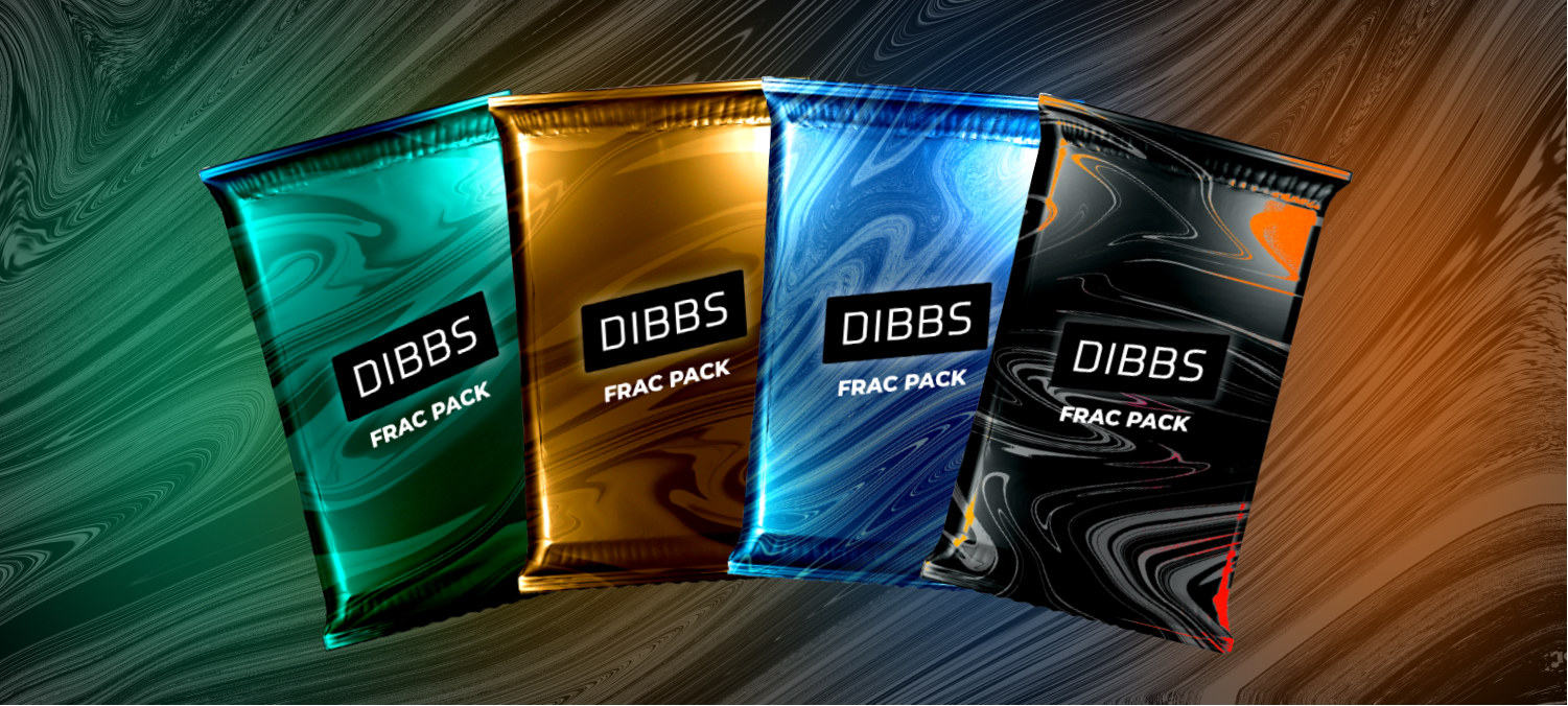
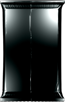
Before I started high fidelity designs there one was thing I had to do, design some new Frac Packs. The old design looked more like a bag of chips than a pack of cards so it needed an update.
Original Pack Design

New Pack Design
I found a blank card pack template that was inline with what I had invisioned.

I removed the line down the center and added a green gradient to match our brand.

I explored different texture graphics till I found one that I thought was a good fit.
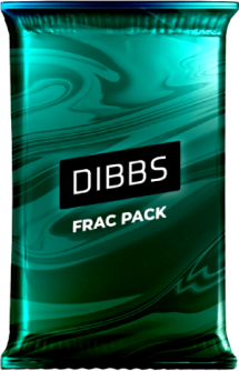
Lastly I added the label and logo with a drop shadow to make it contrast with the background.
New Pack Variations
I wanted to make a few different packs, send them around to see which ones resonated the most. I experimented with a few different colors, pattern variations and overlay methods until I was happy with the four packs below. I shared these with the product team and they got very excited about the possibilities of what we could do with these from a product and marketing perspective. Instead of picking a favorite, we decided we would use them all and have different ones for different pack variations like sports, rookies, hall of famers etc.


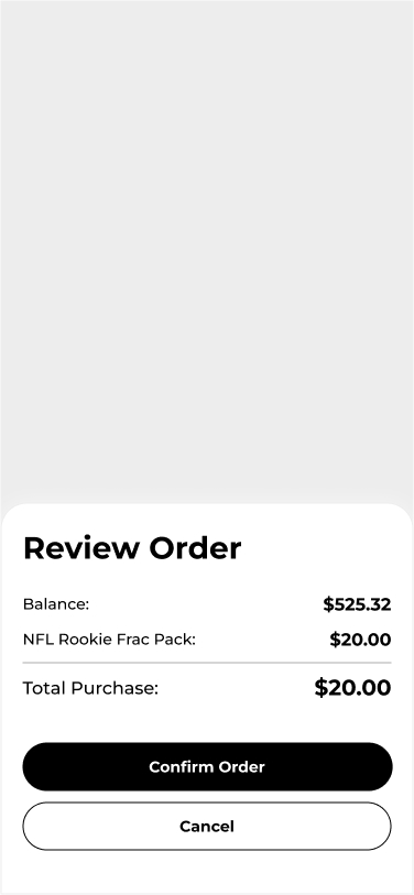
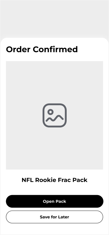
After redesigning the pack I was ready to start on high fidelity designs. I used the colors, spacing, buttons, etc. that I had created in the Dibbs design system to keep it consistent with the rest of our platform. These screens are in order of how a user would go through the flow.


On the first screen I added a section for the most valuable card that was possible to get in the pack, this was based on user feedback from the wireframes. I decided to use a design pattern from our drops page by putting an enlarged version of the card with lower opacity in the background. This was the missing piece I was looking for and it filled in the page nicely.


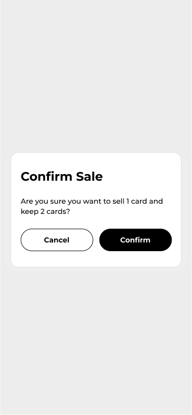
While working on the last two pages in the flow, I realized that in the wireframes I had used a mix of bottom popup modals in the beginning of the flow and page centered modals at the end. I decided to use the bottom popup modals across the board here since it’s such a transactional flow.


One thing that we set out to do at the beginning of this project was give the opening of the Frac Pack a feeling of, “unboxing”. Going through the flow of the high fidelity designs it didn’t really have that feeling. What we were missing was an animation of the pack opening. I reached out to a former colleague, Eric Funk, I sent him over some sketches, we collaborated on a few different options and landed on a short animation which included the pack opening at the top, then growing to the point where it explodes, then fades out to the first card.
After completing all the steps, we handed the project off to developers, and two weeks later, we were ready to launch. The marketing team was confident they could build excitement and predicted the 200 Frac Packs would sell out quickly. We set a new KPI: selling out in under five minutes, based on growing community interest. To achieve this, we hyped the launch on social media and actively engaged our Discord and Twitter communities.
On launch day, we gathered on Zoom to watch the release at 10 AM. Predictions ranged from 30 seconds to an hour, but by 10:01:30, all packs were sold out—just 90 seconds! The team erupted in cheers, celebrating what became our startup’s most thrilling moment. It was incredibly rewarding to see our hard work and design exceed expectations.
While Dibbs Marketplace has since pivoted to another business model, I’m still deeply proud of what we built and the incredible success we achieved with this project.